OBJECTIVE
The objective of this project was to promote a Valentine’s Day product line through a strong emotional concept while reinforcing Converse’s identity as a timeless and youth-driven brand. The campaign was designed to function across multiple platforms, including outdoor advertising, digital marketing, and social media. Another key goal was to create an original slogan and custom hand-lettered typography that would bring authenticity and personality to the campaign while strengthening the overall visual identity.
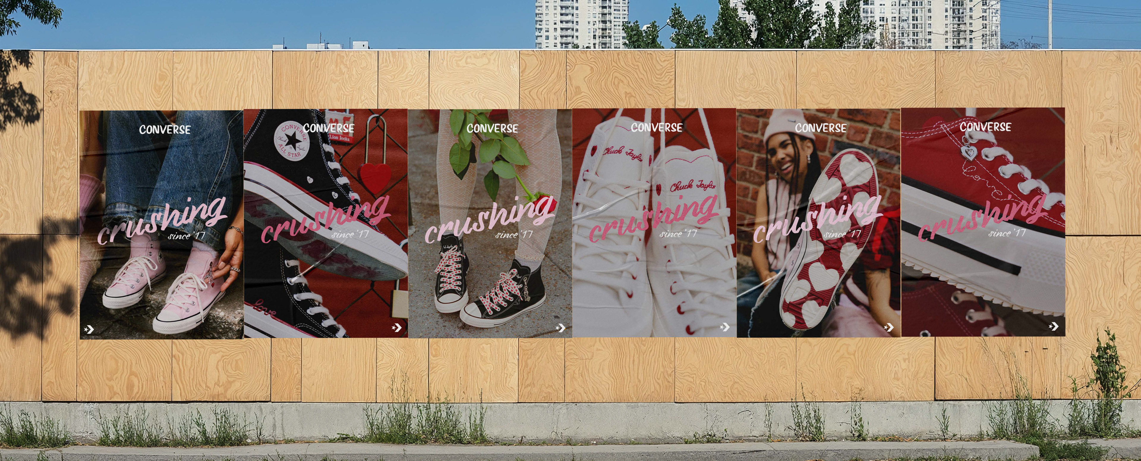
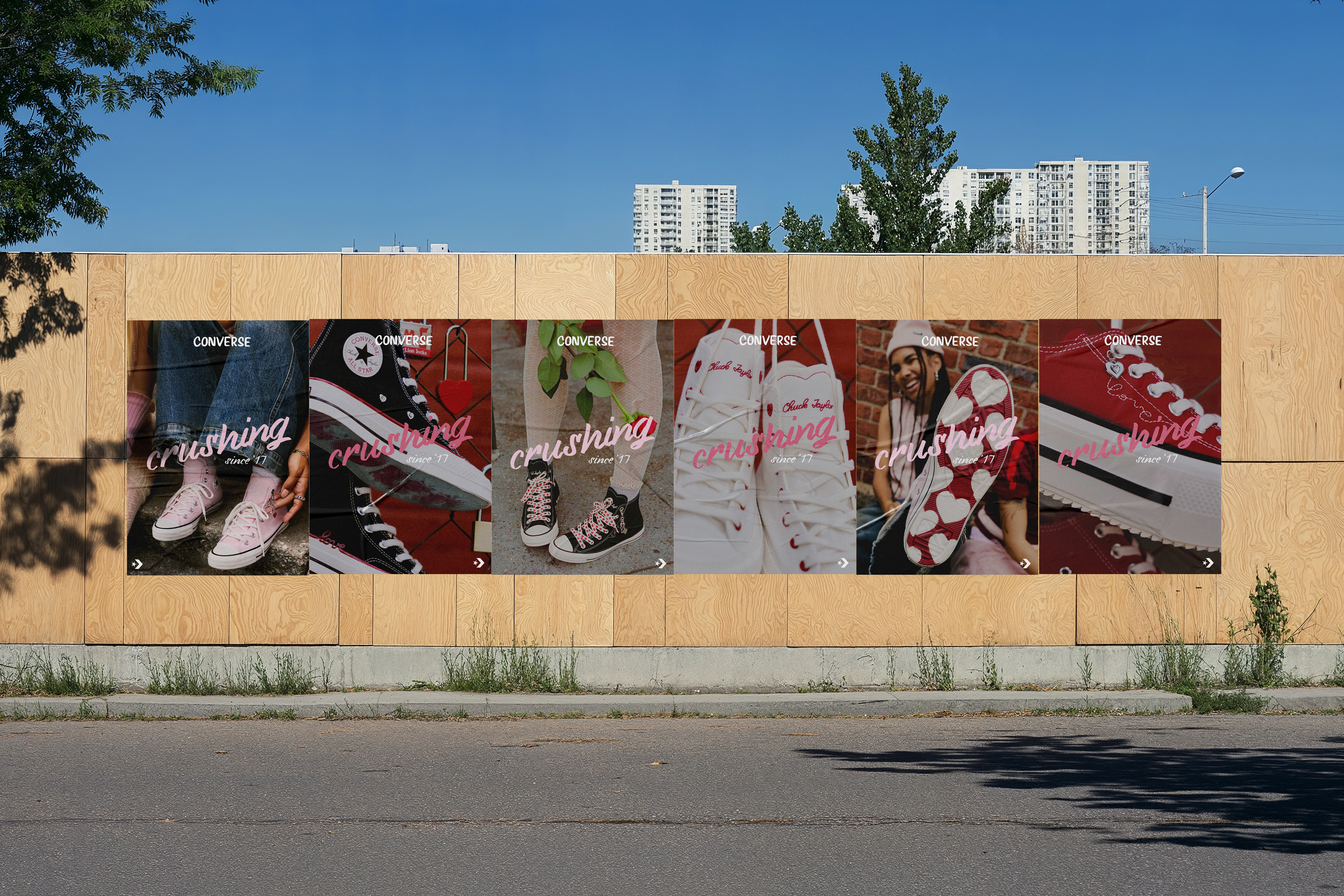
CAMPAIGN POSTER SERIES
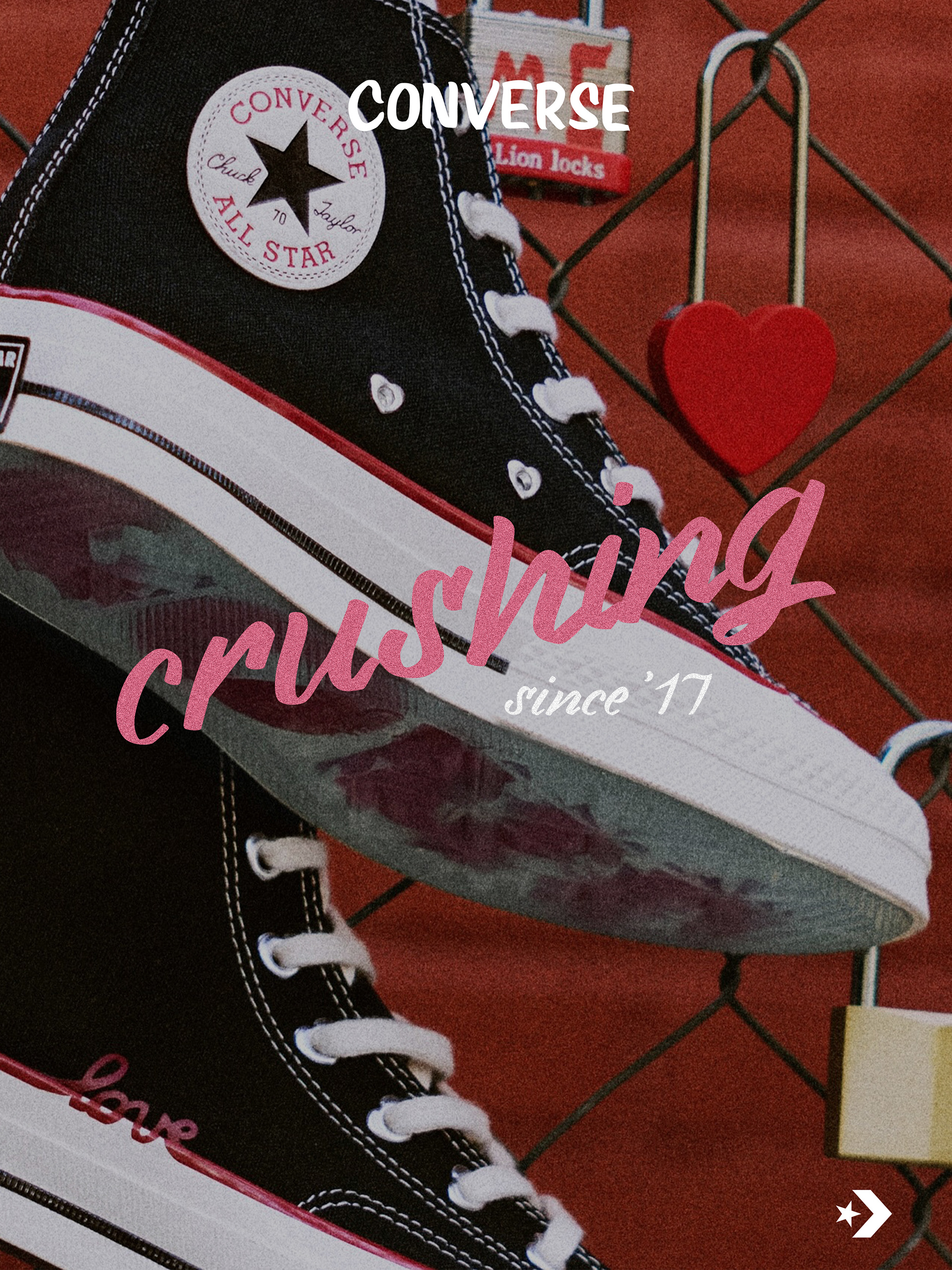
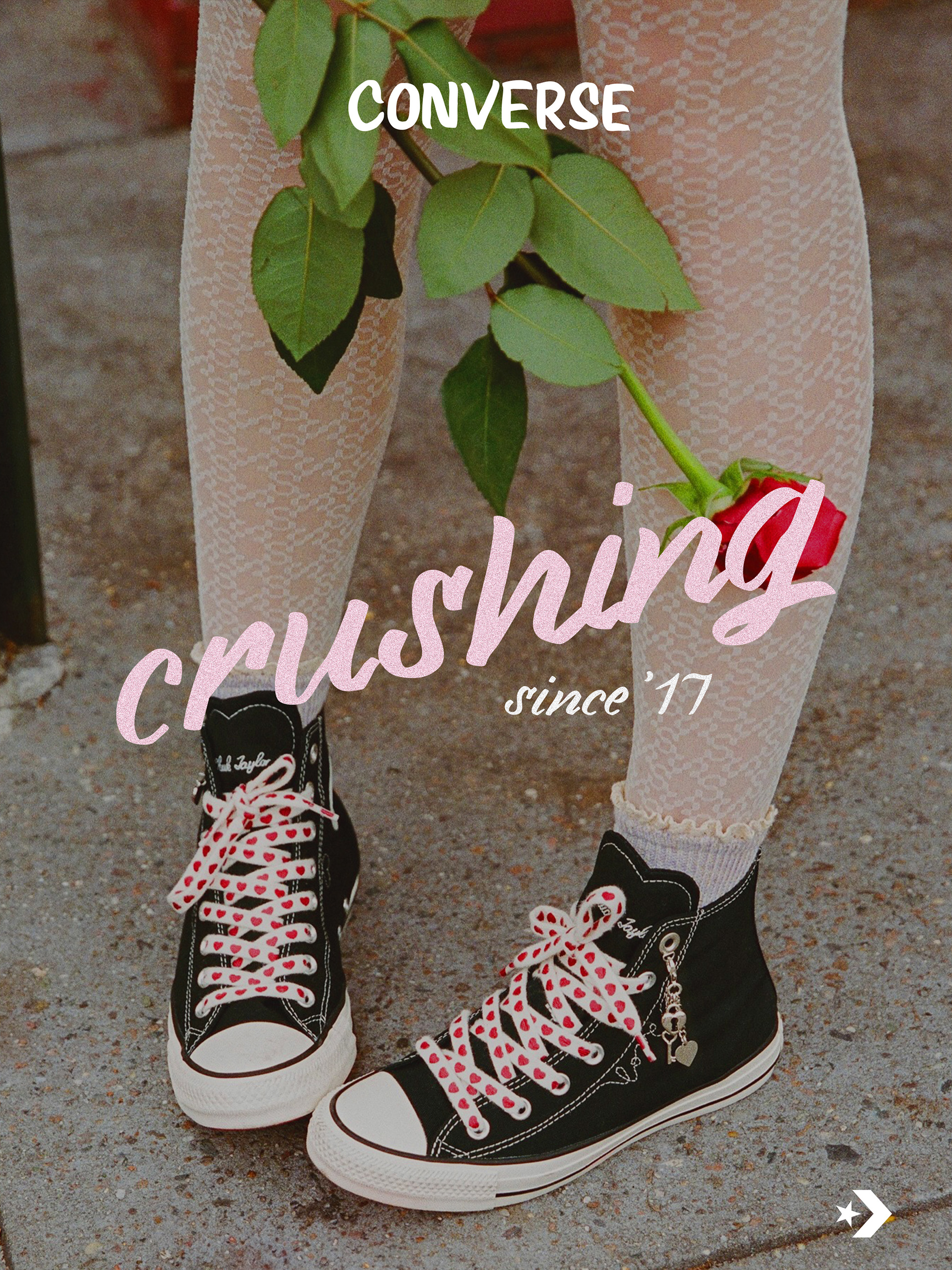
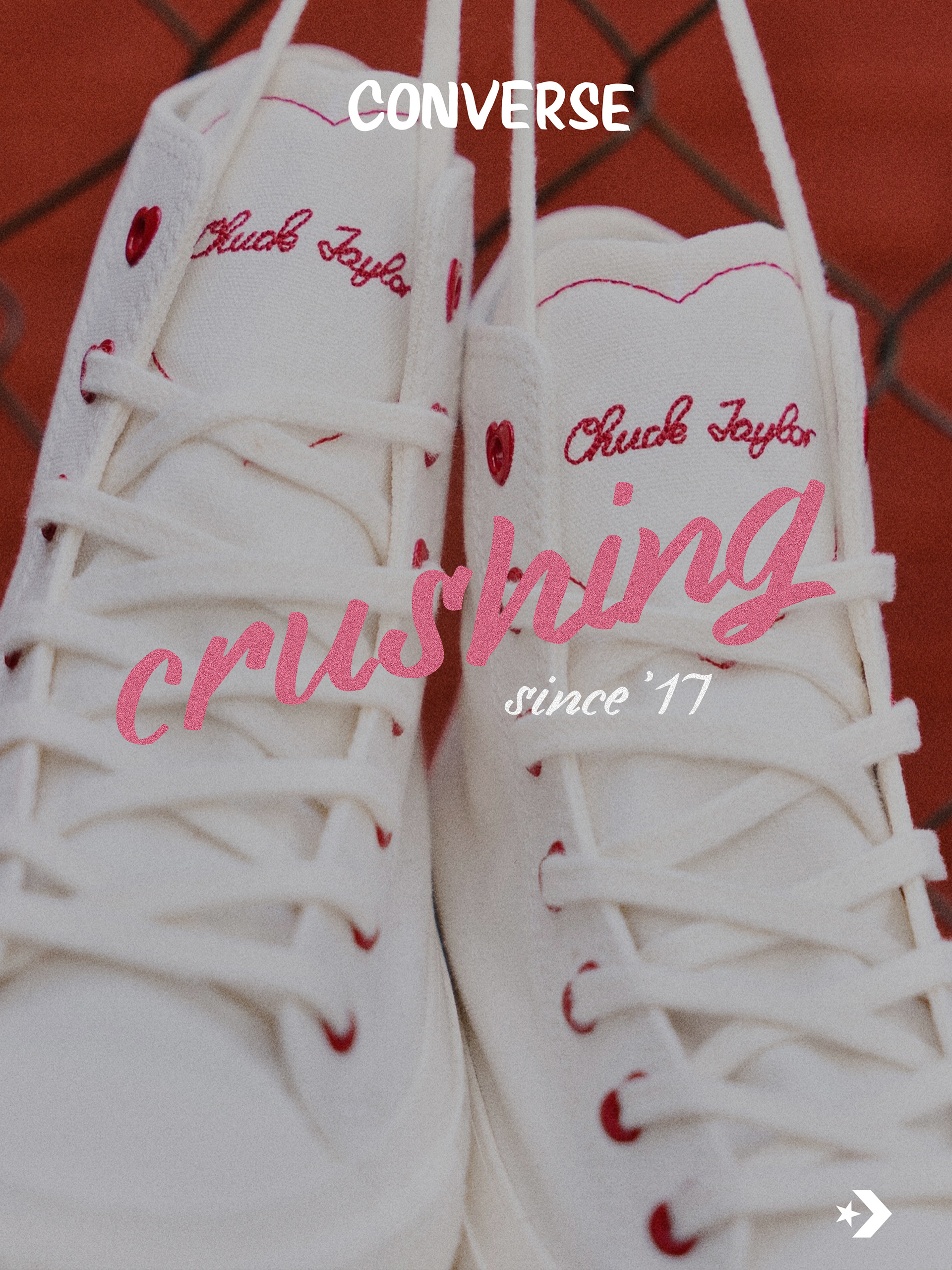
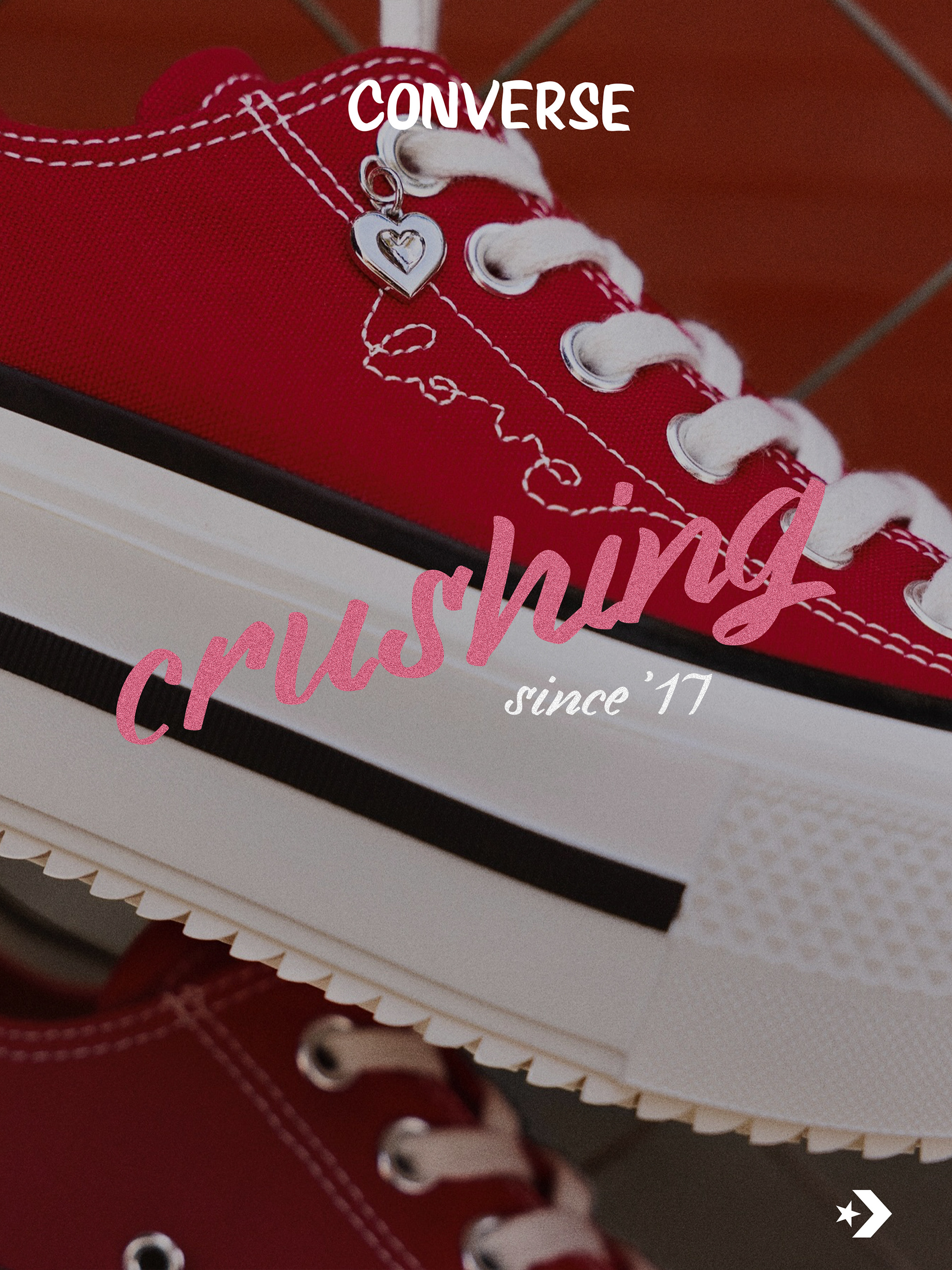
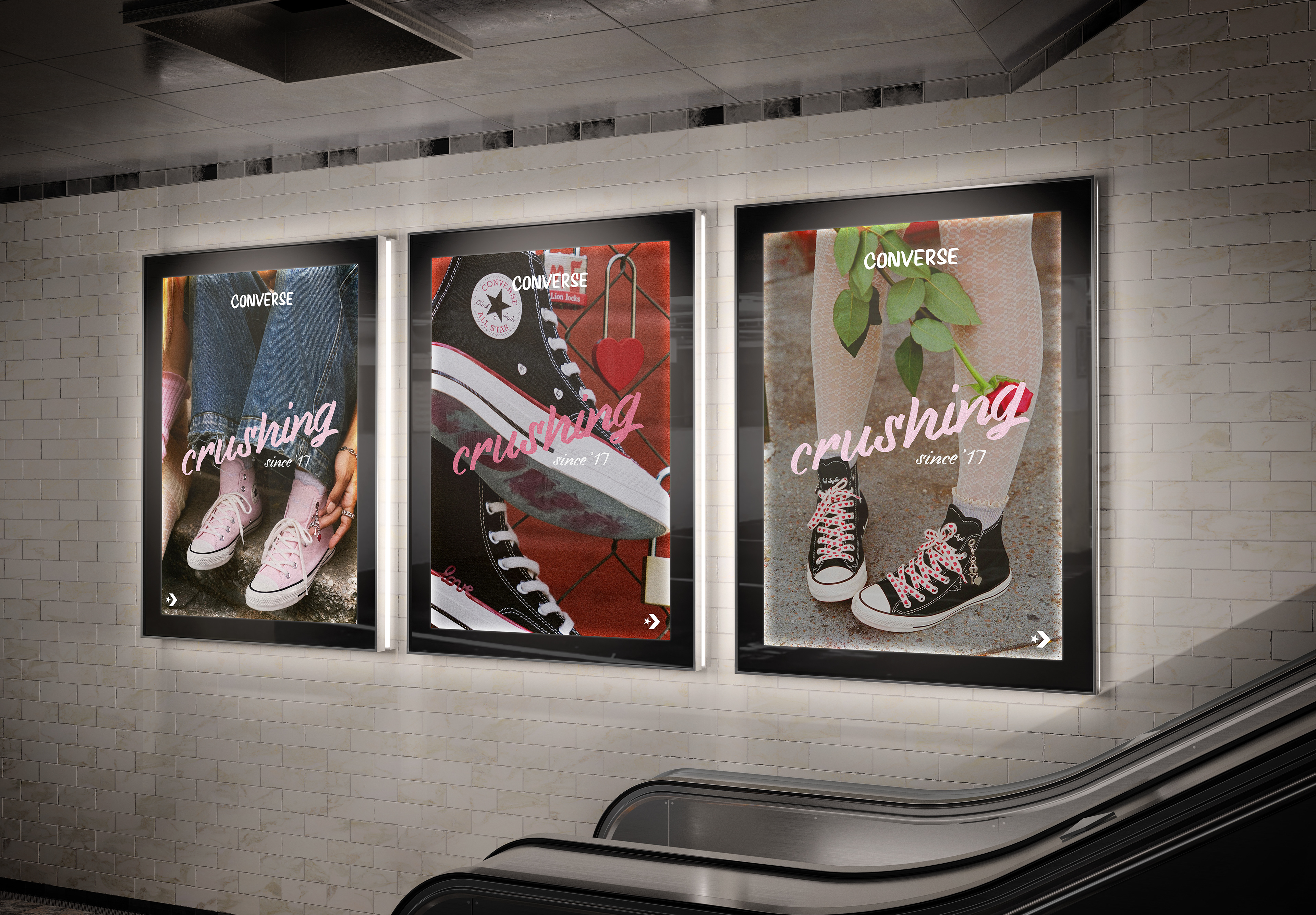
The campaign includes six posters designed to function both as individual visuals and as a connected series. Each poster varies slightly in composition, color balance, and emotional tone, while consistent typography, color usage, and slogan placement maintain strong brand recognition throughout the series. The posters were designed with outdoor advertising in mind, ensuring strong readability and visual impact when displayed in large formats such as billboards, transit ads, street posters, etc.


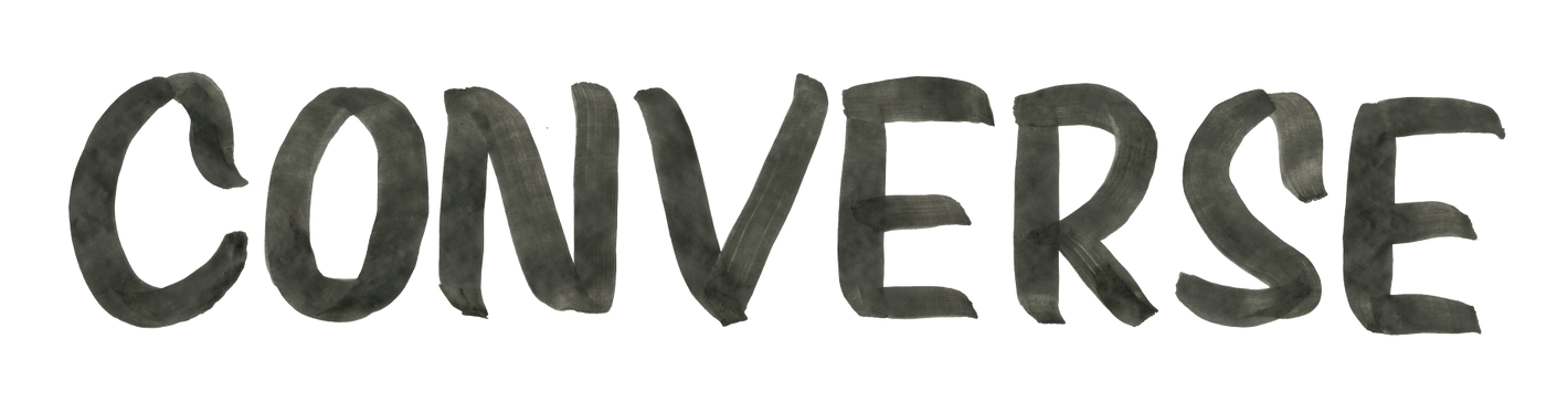
TYPOGRAPHY & HAND LETTERING
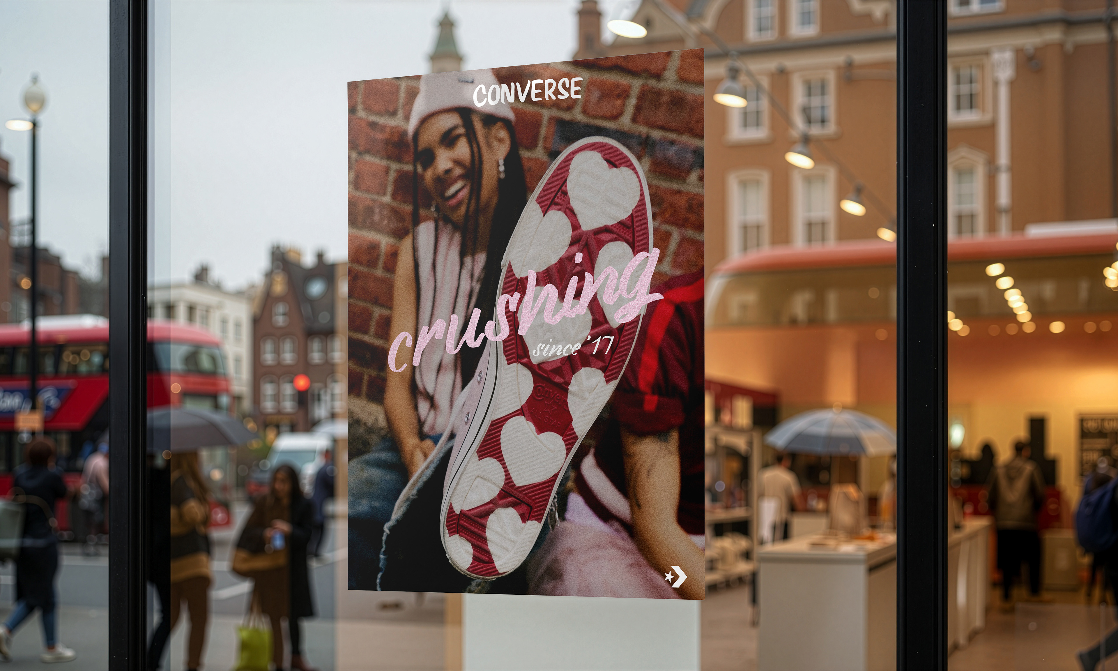
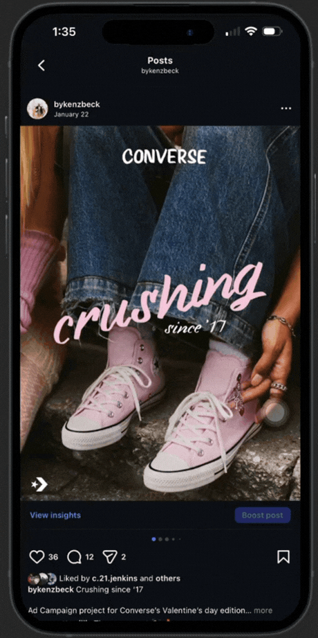
A defining element of the campaign is the custom hand-lettered slogan used throughout the designs. The lettering was intentionally created to feel personal and intimate, similar to handwriting on a Valentine’s card. This approach adds a romantic and playful tone while contrasting with the brand’s typically bold and structured typography. The hand lettering acts as both a visual signature and a storytelling element, helping the campaign feel more human and expressive while reinforcing the idea of individuality and authenticity associated with the Converse brand.

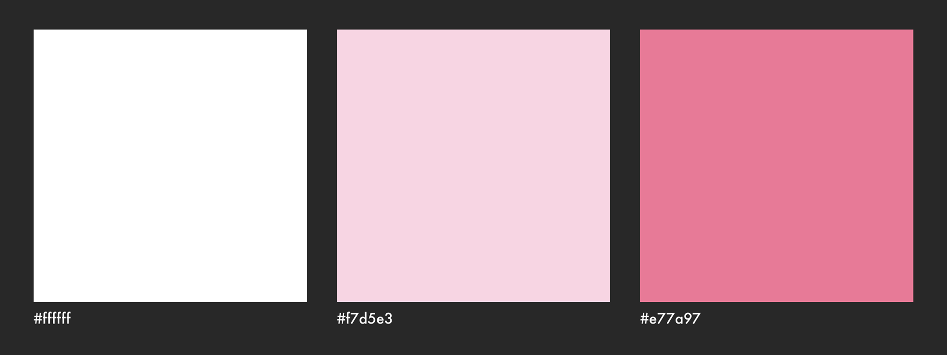
COLOR PALETTE
The color palette focuses on white, soft pink, and a deeper pinkish-red to reflect the romantic Valentine’s theme while keeping the designs clean, playful, and visually cohesive.
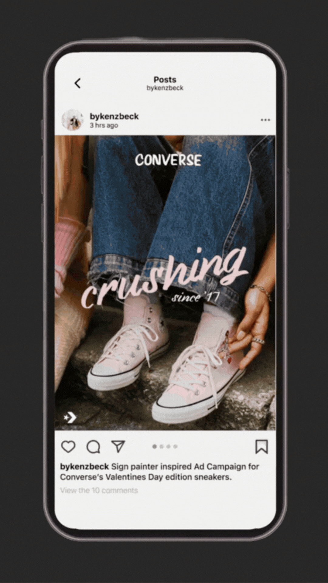
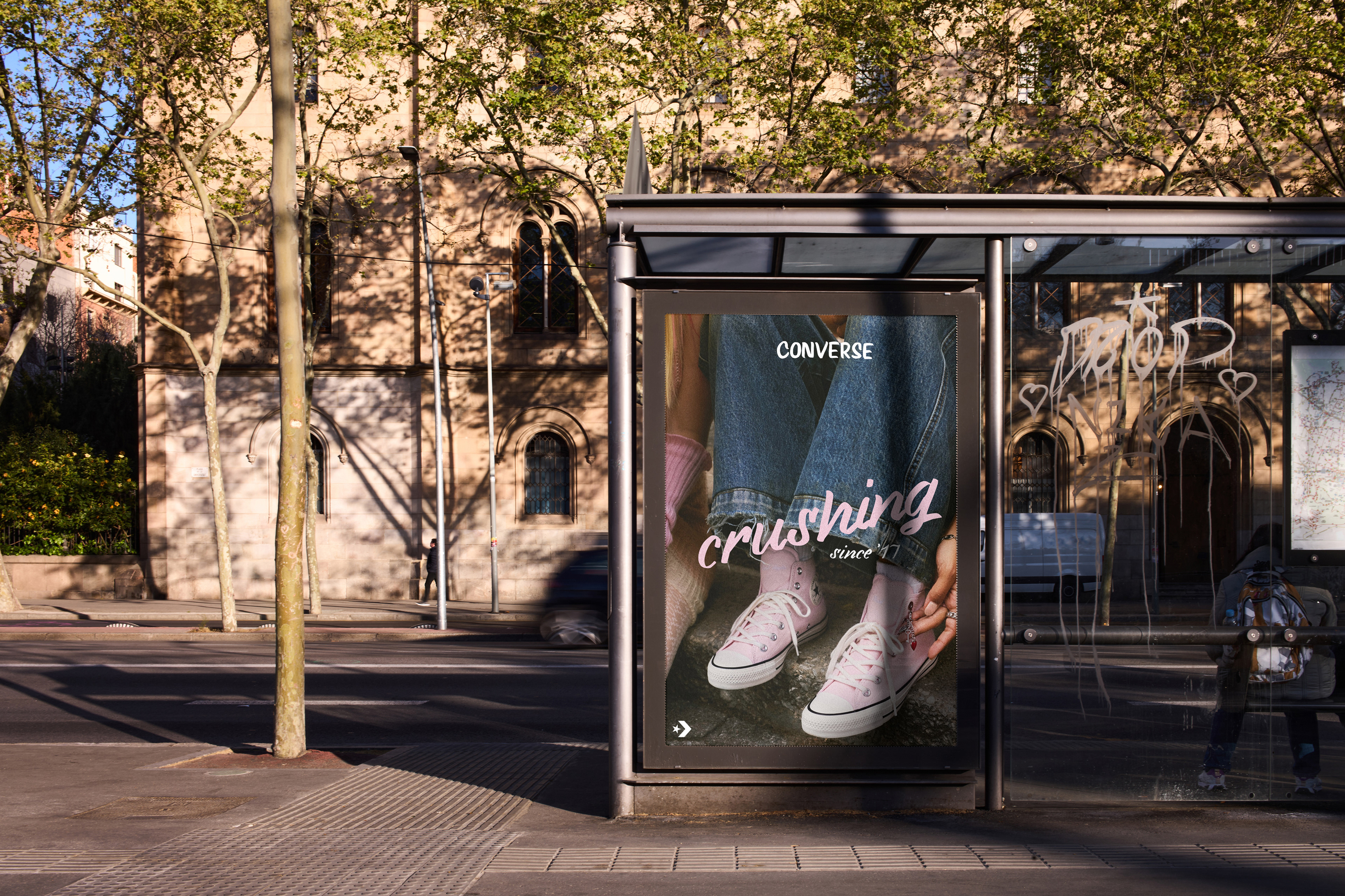
REAL-WORLD APPLICATIONS
A series of applications were created to demonstrate how the campaign could exist in real-world environments. These showcase the posters and campaign visuals across outdoor billboards, retail displays, digital advertisements, and social media feeds. Presenting the work in these contexts helps communicate the scalability of the campaign and shows how the visual system maintains its impact across different formats, sizes, and environments.
REFLECTION
This project reinforced the importance of emotion-driven branding within seasonal campaigns and showed how handmade typography can add personality and authenticity to commercial design. It demonstrated the value of creating modular design systems that can adapt across multiple platforms.