SERVICES
Responsive Design and UI Design
PROBLEM
Craft & Common’s digital presence did not fully communicate the brand’s warm, seasonal atmosphere or support a clear path for online ordering. The existing experience lacked visual cohesion and structure across devices, making it harder for users to move naturally from exploring drinks to completing a purchase. A more intentional system was needed to connect brand identity with usability while maintaining consistency across laptop, tablet, and mobile screens.
SOLUTION
The final rebrand introduces a responsive interface that blends Craft & Common’s cozy, seasonal identity with a structured e-commerce experience. Clear visual hierarchy, consistent styling, and intuitive navigation create a guided journey from landing to checkout. By prioritizing readability, product focus, and responsive layouts, the design delivers a cohesive experience that feels welcoming while making browsing and purchasing straightforward on any device.
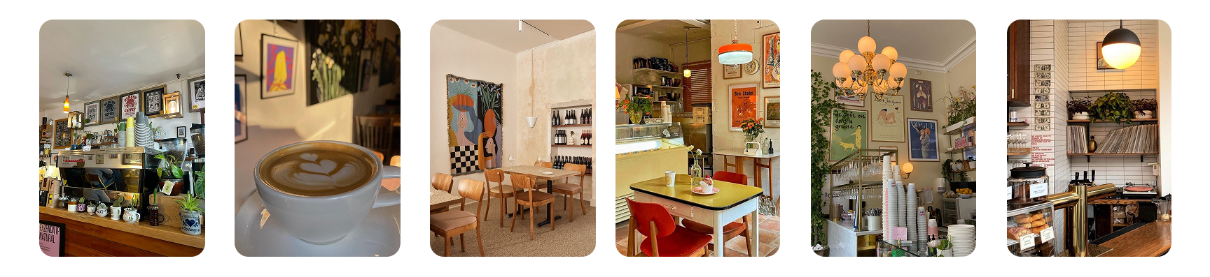
RESEARCH
My research focused on comparing Craft & Common’s existing website with the experience of visiting the café in person. While the physical space felt warm, inviting, and visually intentional, the website didn’t fully capture that same atmosphere or sense of personality. Observing the in-store environment, from the presentation of drinks to the overall mood, highlighted opportunities to bring more of that feeling into the digital experience. This comparison helped guide design decisions by prioritizing warmth, visual consistency, and a clearer path for ordering, ensuring the redesigned interface better reflects the brand customers experience in person.
MOODBOARD
This moodboard informed the visual direction of the Craft & Common rebrand by focusing on warmth, personality, and layered detail. The imagery highlights cozy lighting, curated objects, and pops of color that create an inviting, lived-in atmosphere. I translated these qualities into the website through warm tones, product-focused imagery, and dense but organized layouts. Together, these elements help the digital experience feel welcoming and intentional while still supporting clear navigation and usability.
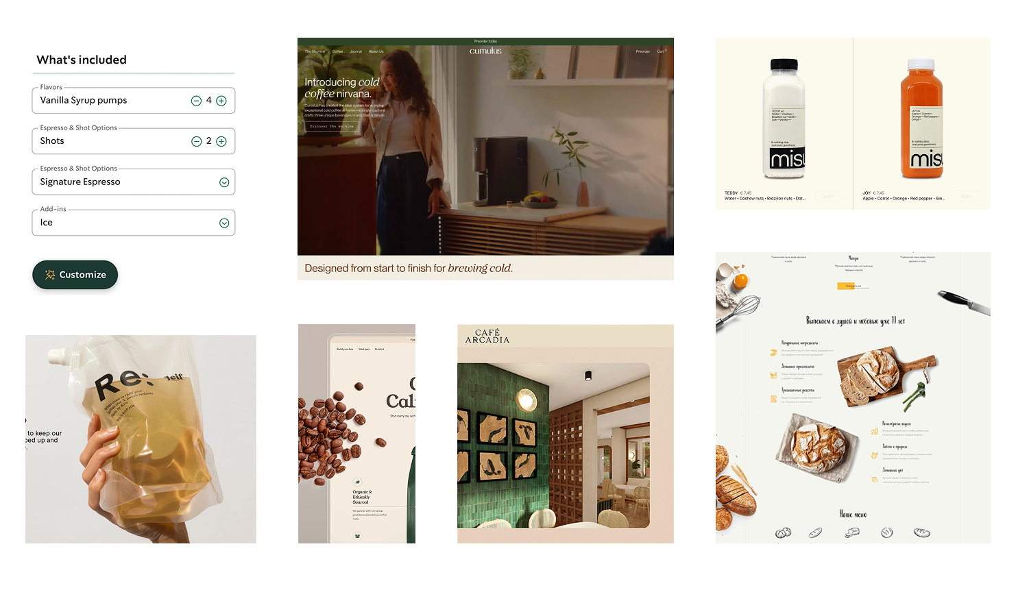
INSPIRATION
This inspiration board guided the structure and visual direction of the Craft & Common rebrand by focusing on clean e-commerce layouts, product-forward imagery, and clear purchasing flows. I studied how other brands present customization options, highlight product details, and use rounded imagery, layered photography, and warm color palettes to create a polished but approachable interface. These references informed decisions around hierarchy, spacing, and product presentation, helping shape a website that feels modern and organized while still reflecting Craft & Common’s warmth and personality.
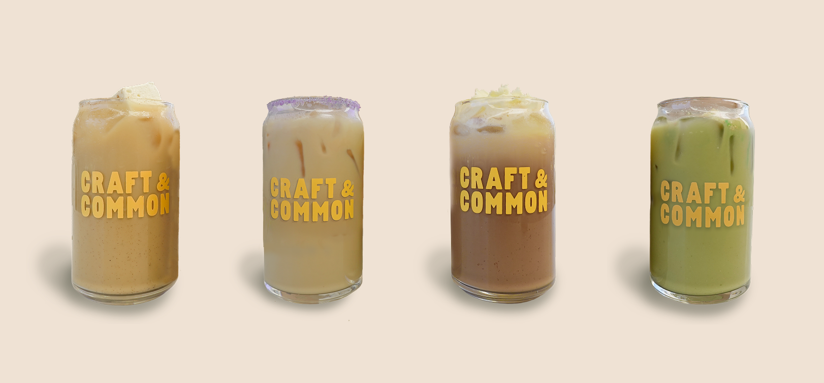
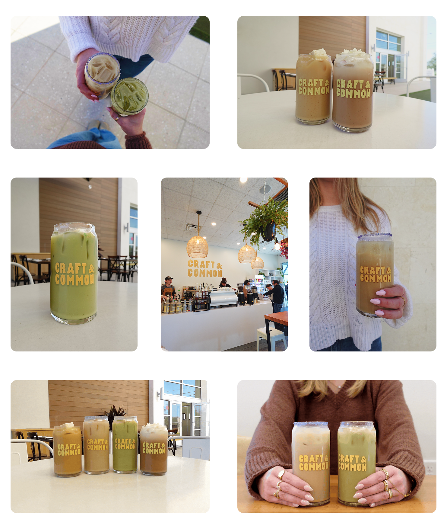
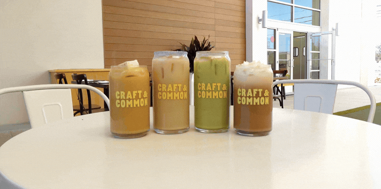
PHOTOGRAPHY AND VIDEOGRAPHY
Creating my own photography and video content for this rebrand was both enjoyable and an important part of the design process. Capturing the drinks, space, and atmosphere firsthand allowed me to intentionally frame visuals that matched the warm, inviting tone I wanted the website to communicate. This hands-on approach helped ensure consistency between the brand direction and the imagery, while also giving me more flexibility in how products were presented. Producing original content not only strengthened the visual identity of the project, but also made the case study feel more personal and cohesive.
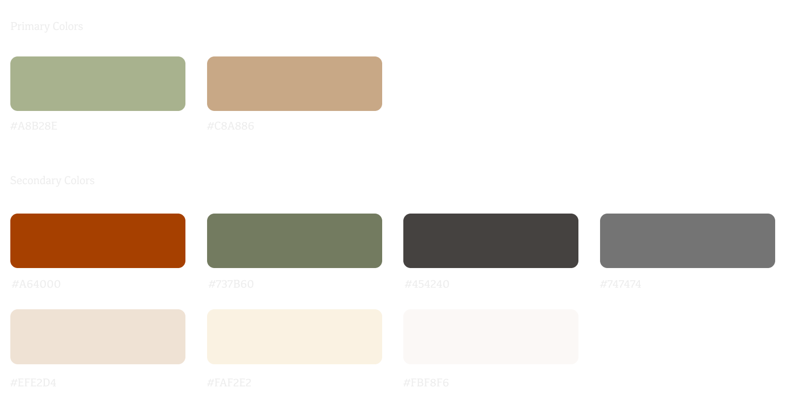
COLOR PALETTE
The color palette for this rebrand was chosen to reflect Craft & Common’s warm, cozy atmosphere while supporting a clear and inviting digital experience. I focused on earthy neutrals and soft, seasonal tones that echo the café’s in-person environment and complement the product photography. These colors help create a sense of comfort and familiarity while maintaining enough contrast for readability and navigation. By balancing warmth with usability, the palette reinforces the brand’s personality while keeping the interface approachable and easy to browse.
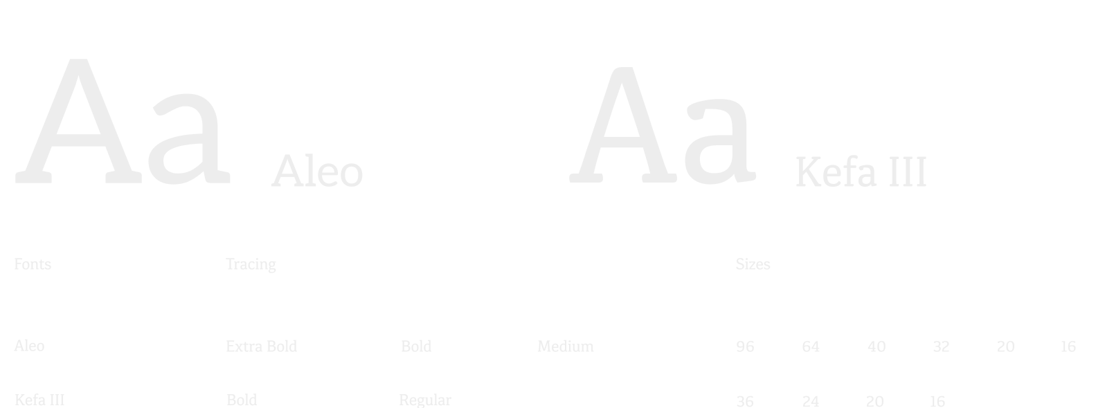
TYPOGRAPHY
The typography for this rebrand was selected to balance personality with readability while staying visually aligned with Craft & Common’s existing logo. I chose Aleo for headers because its weight and structure closely echo the feel of the logo typeface, helping create a cohesive brand presence while establishing strong hierarchy. Using Aleo in extra bold, bold, and medium weights allows headlines to guide attention and add rhythm across the layouts. Kefa III was paired with Aleo for the body copy in bold and regular weights to maintain clarity and legibility without competing with the headers. Together, these type choices create contrast and consistency, reinforcing the brand’s identity while supporting an approachable and organized interface.
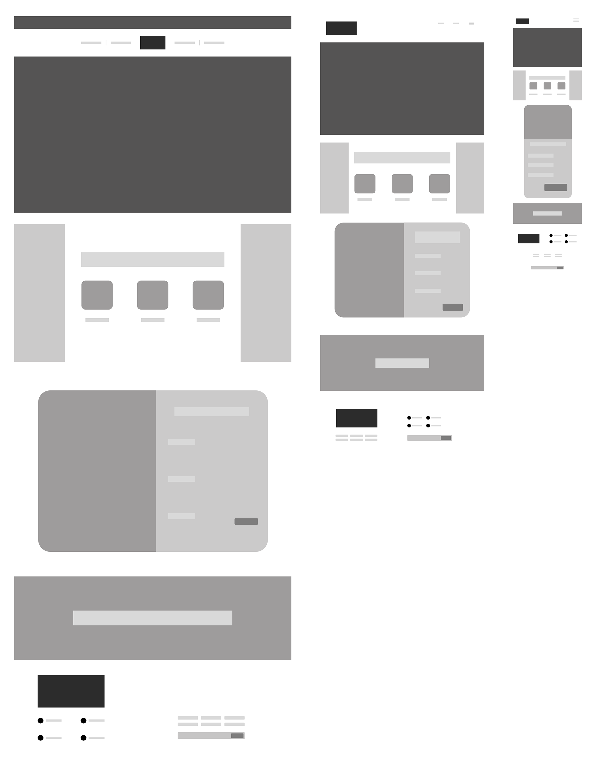
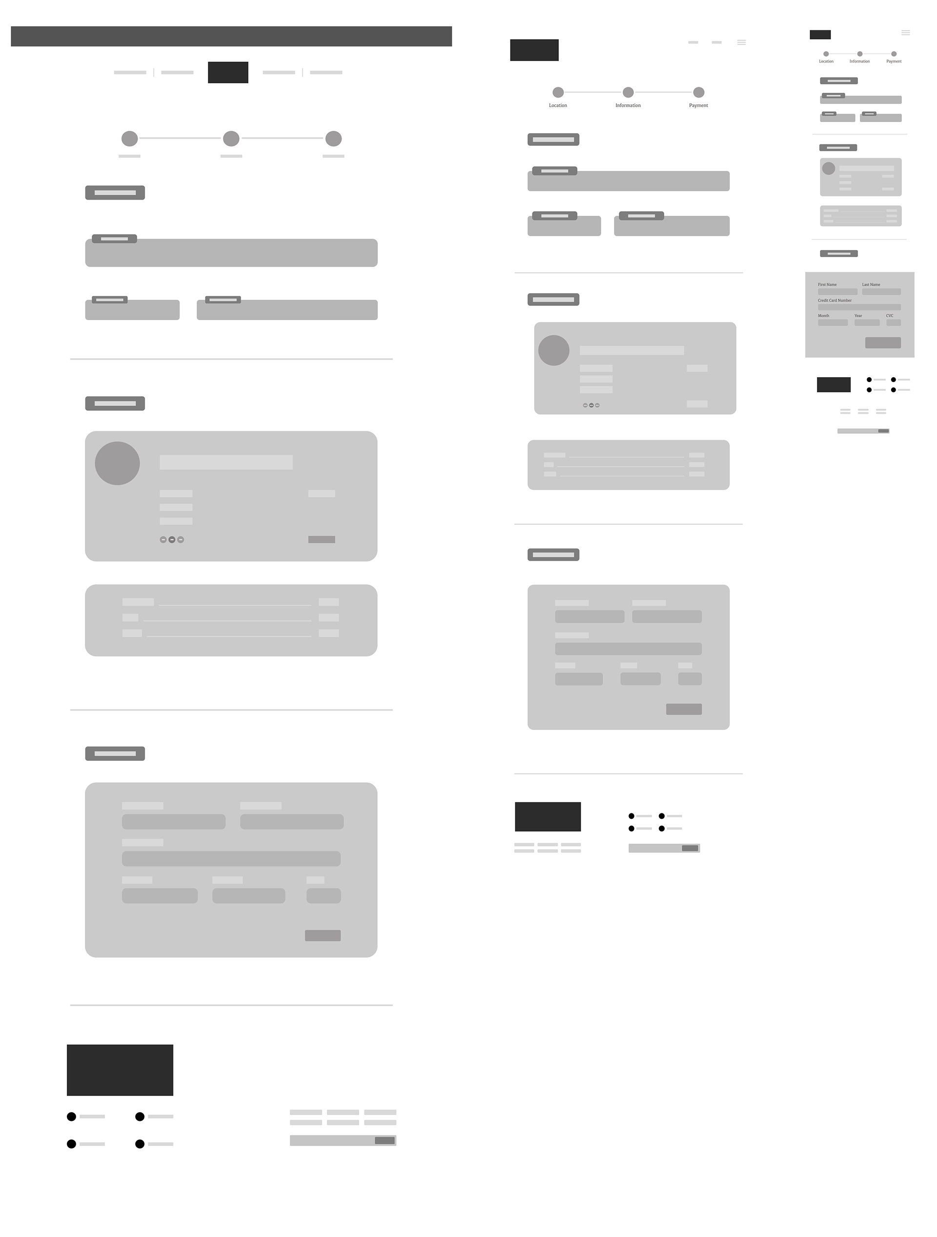
WIREFRAMES
Landing Page
From Left to Right — Desktop, Tablet, Mobile
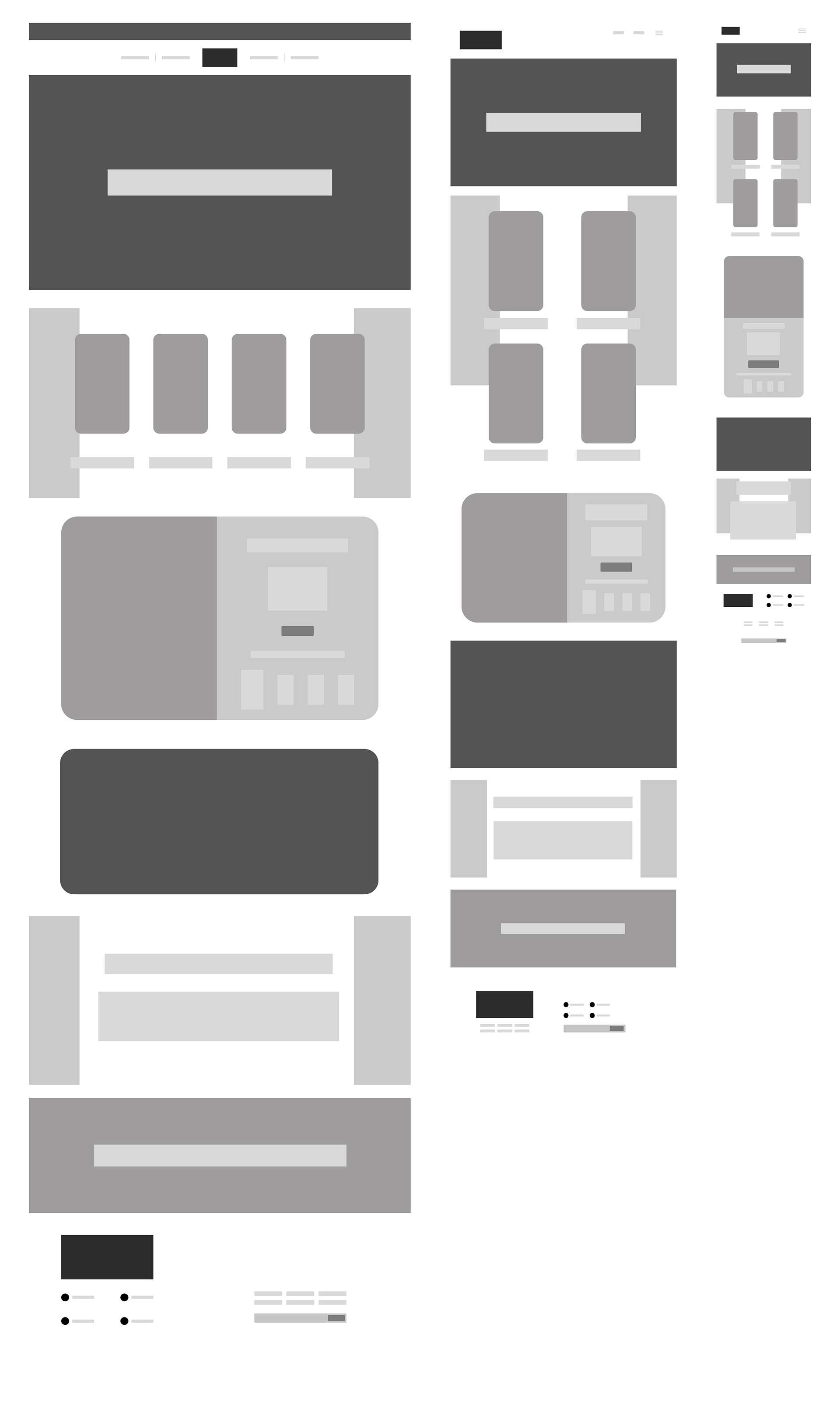
Product Page
From Left to Right — Desktop, Tablet, Mobile
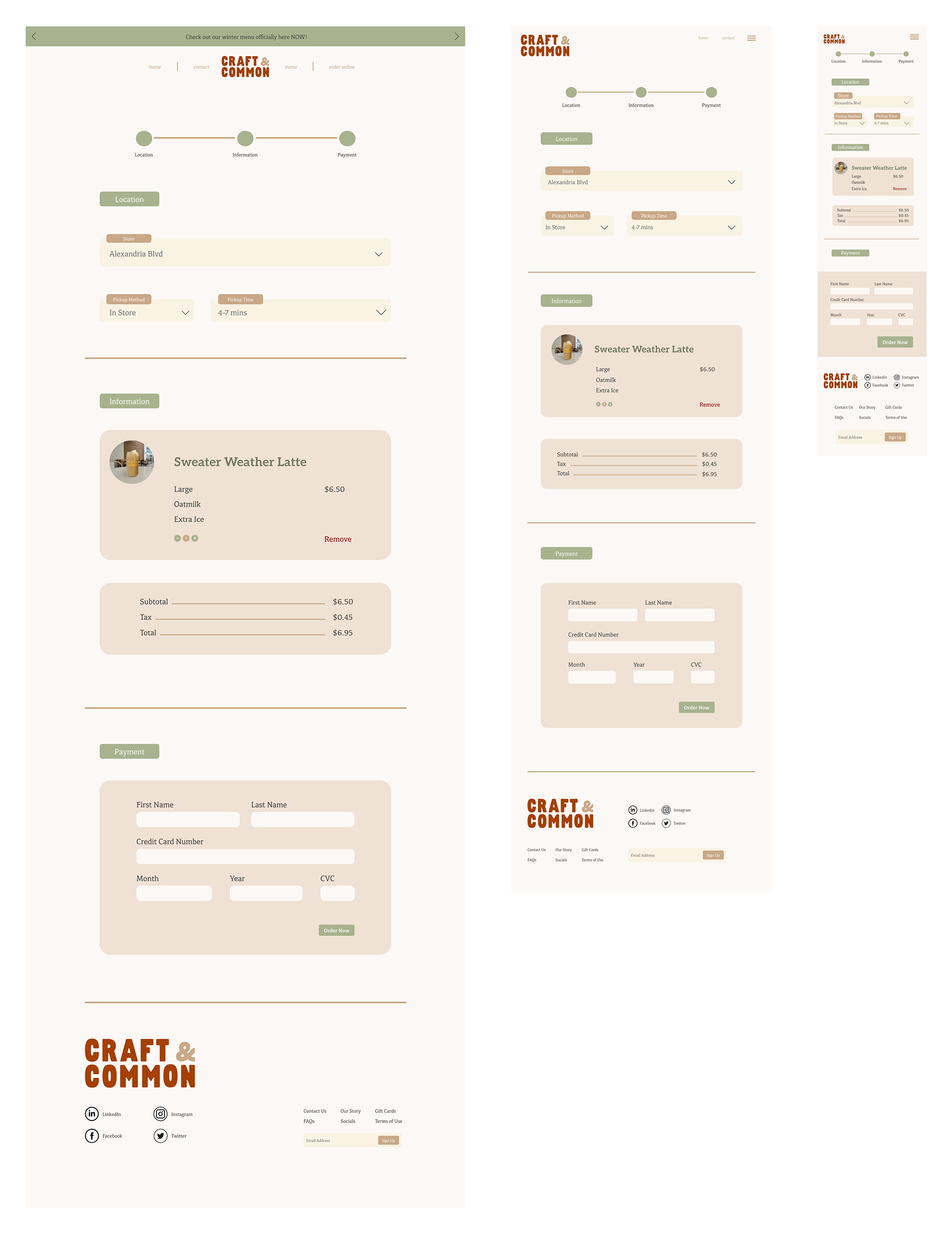
Checkout Page
From Left to Right — Desktop, Tablet, Mobile
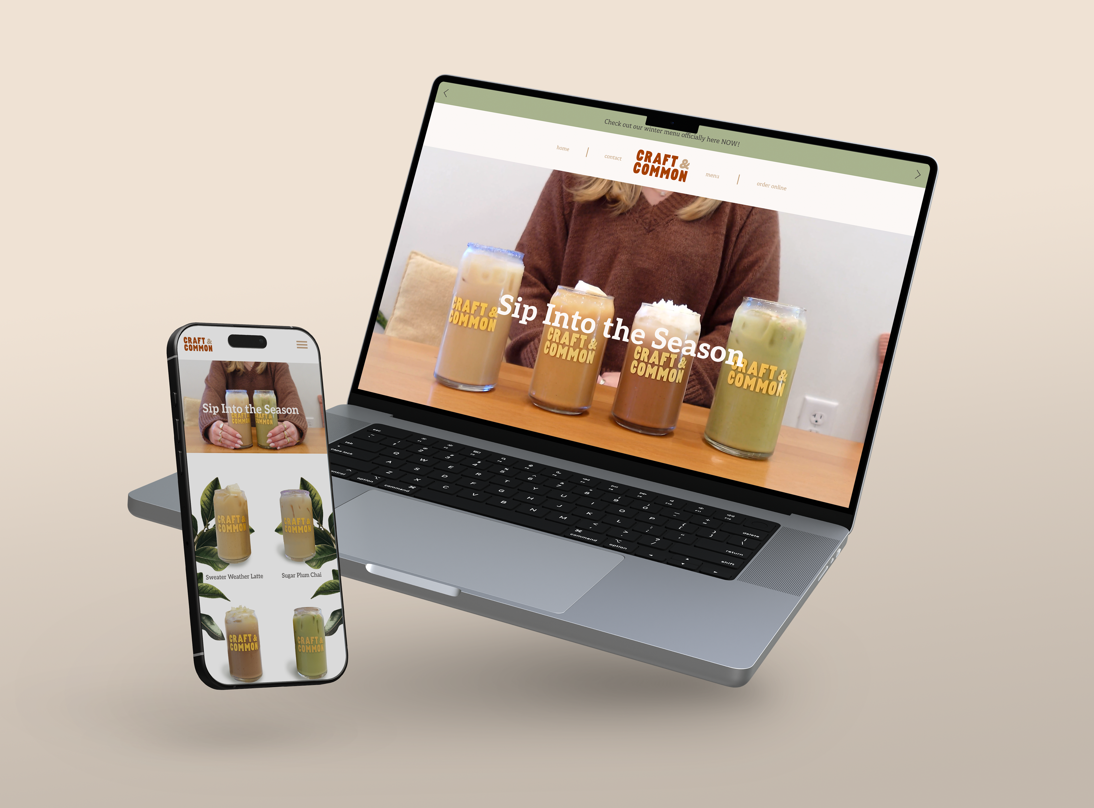
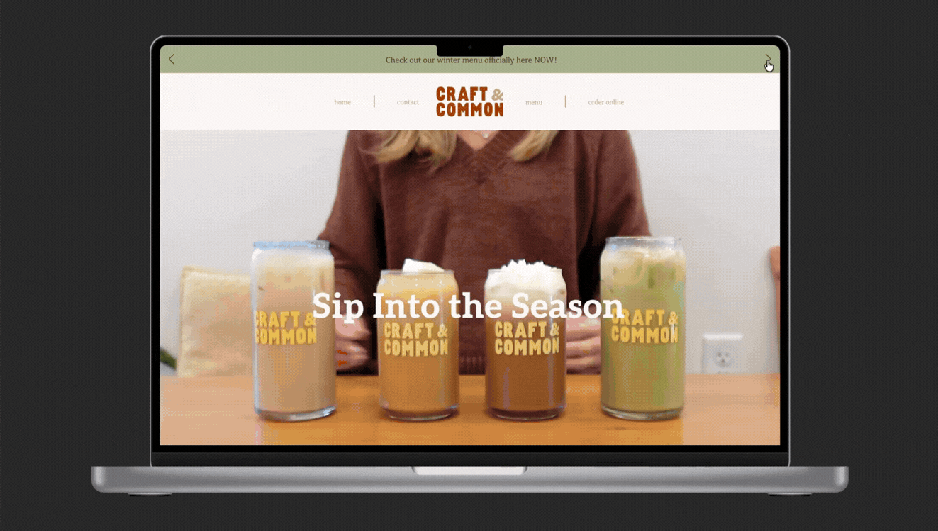
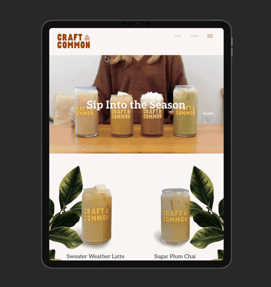
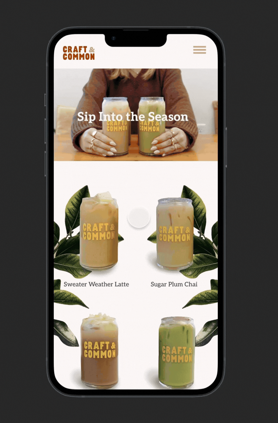
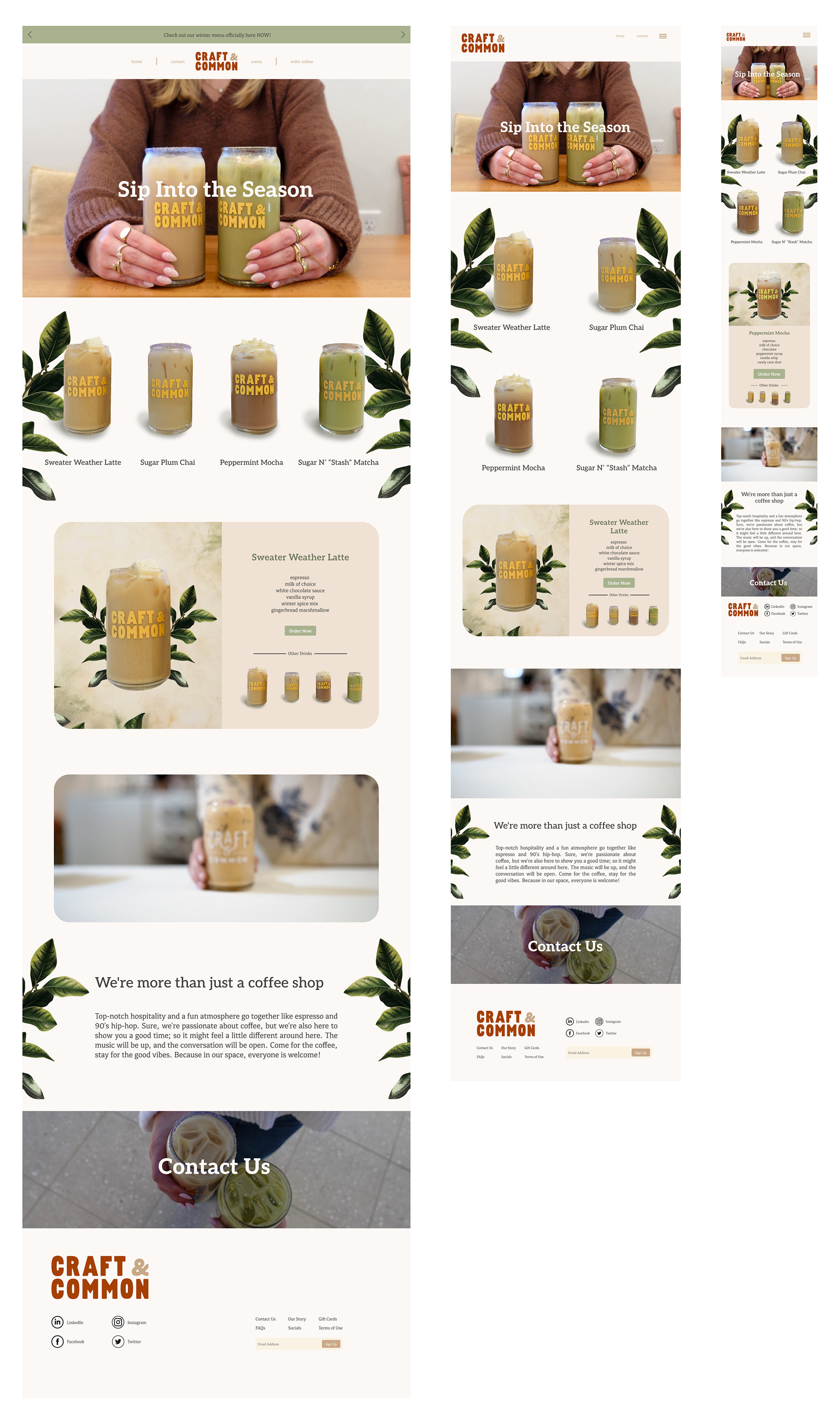
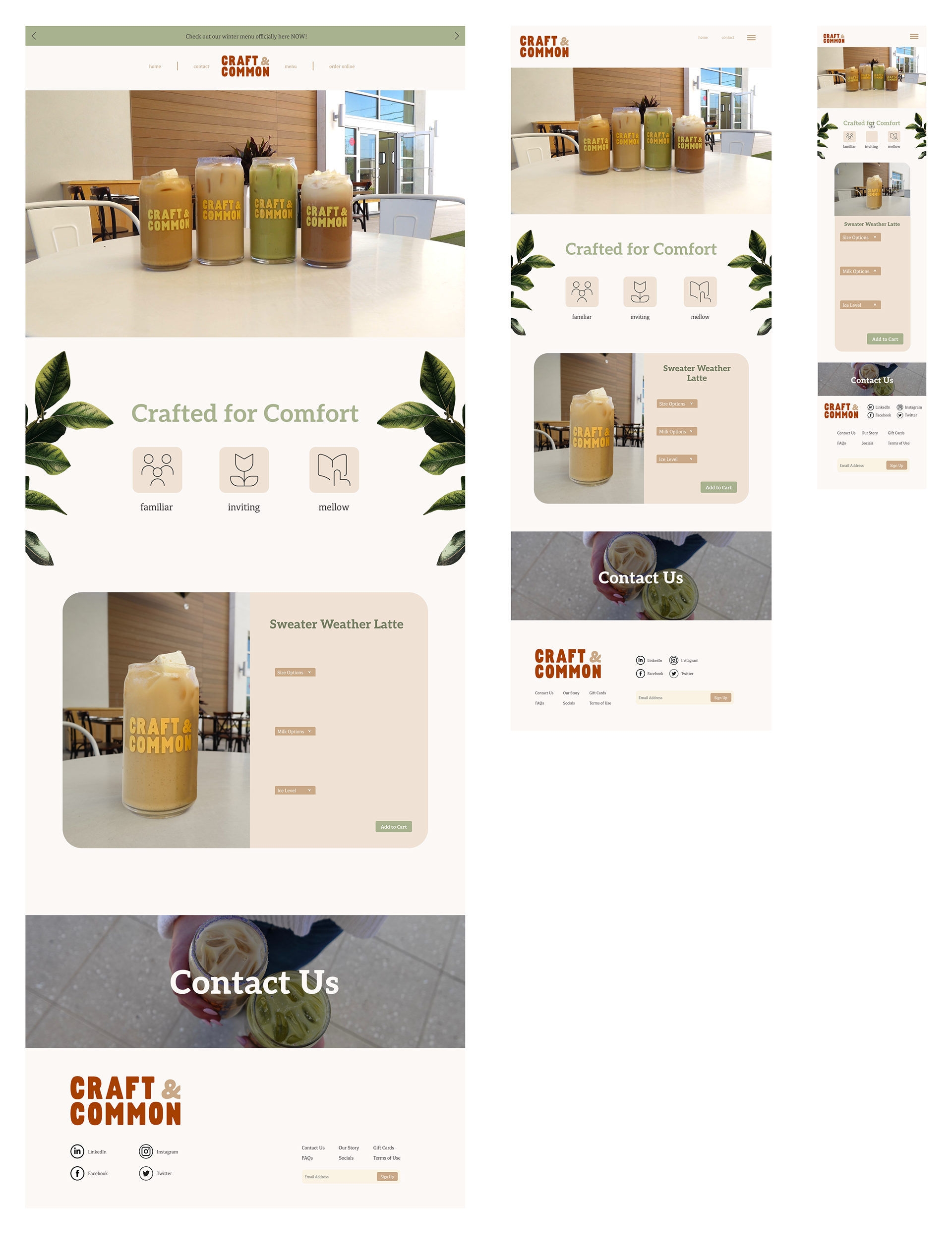
DIGITAL LAYOUT
Landing Page
From Left to Right — Desktop, Tablet, Mobile
Product Page
From Left to Right — Desktop, Tablet, Mobile
Checkout Page
From Left to Right — Desktop, Tablet, Mobile
TAKEAWAYS
This project pushed me to think beyond aesthetics and focus on translating a brand’s atmosphere into a digital space. Observing Craft & Common in person and creating my own visual content guided decisions around layout, color, and typography so the site felt cohesive and intentional. Through this process, I strengthened my skills in responsive design, visual hierarchy, and brand translation, creating an experience that feels both inviting and functional.