PROBLEM
Large music festivals like Lollapalooza attract thousands of attendees, which can make the environment feel overcrowded and overwhelming. With multiple stages, vendors, restrooms, and activities spread across a large area, it can be difficult for people attending to quickly find what they are looking for. This confusion can lead to congestion in certain areas, missed performances, and a less safe or organized festival experience.
SOLUTION
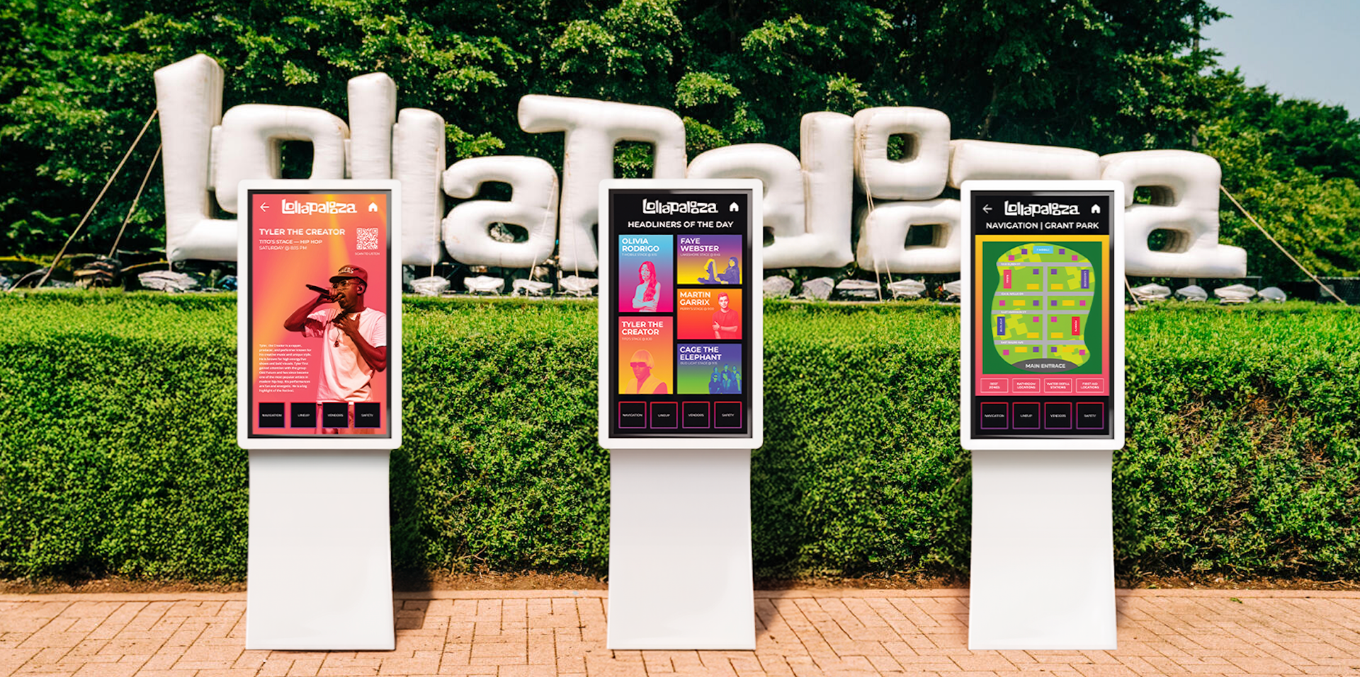
An interactive informational kiosk helps improve the festival experience by giving attendees an easy way to navigate the event. The kiosk provides a digital map, stage schedules, directions to important locations, etc. By helping people quickly find where they need to go, the kiosk reduces confusion, spreads foot traffic more evenly throughout the festival, and creates a safer, more organized environment for everyone.
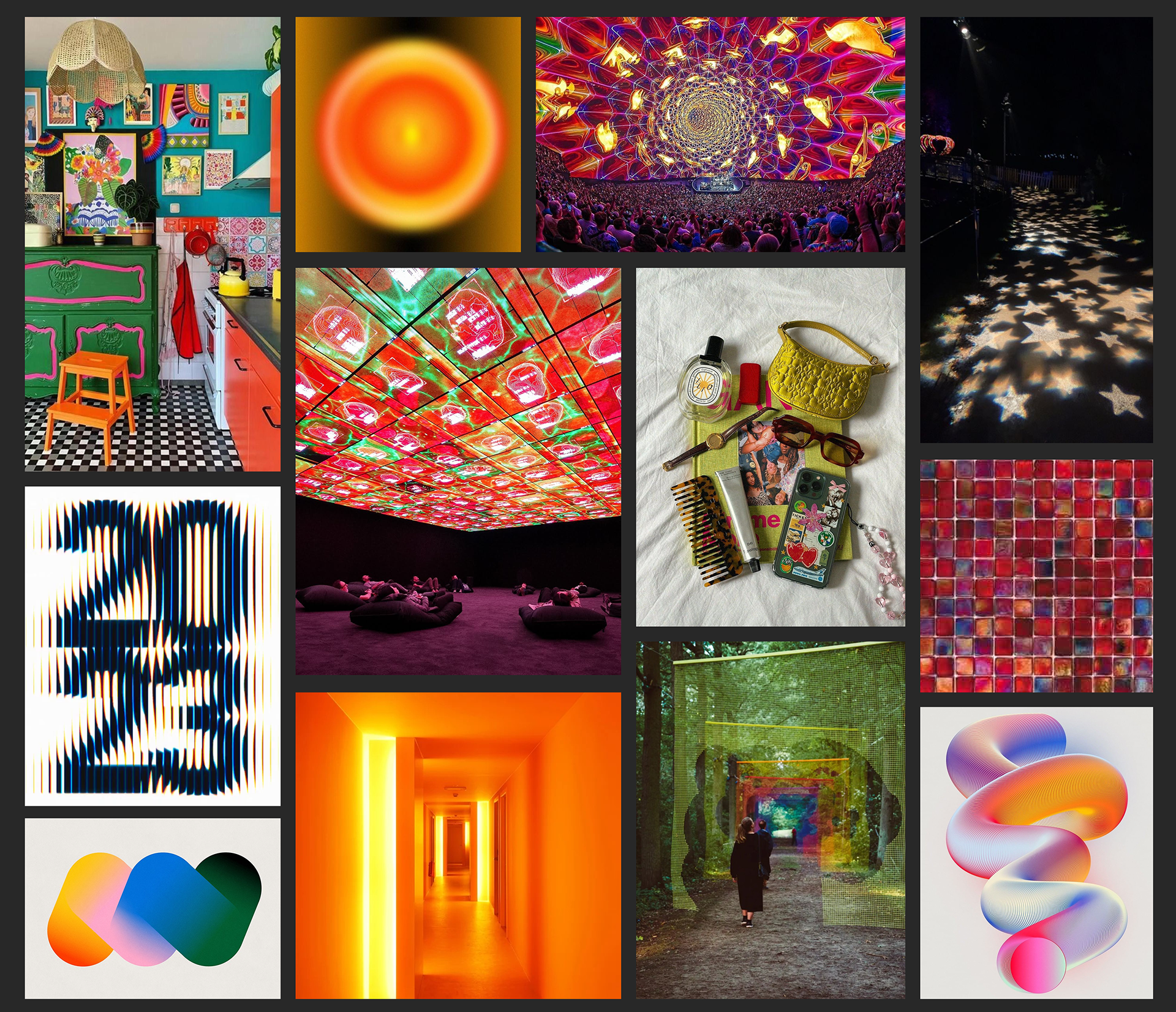
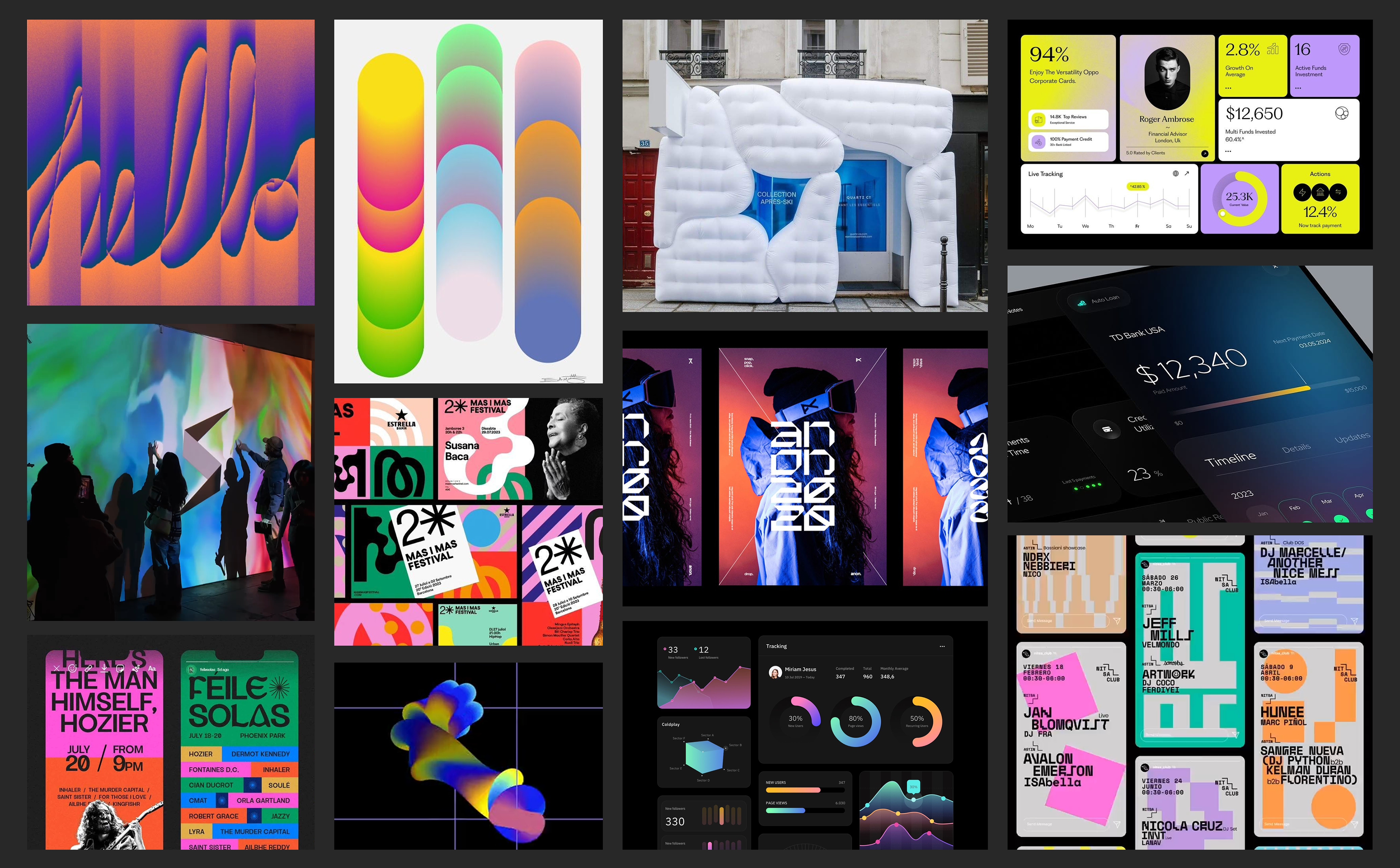
MOODBOARD
INSPIRATION BOARD
PROCESS & IDEATION
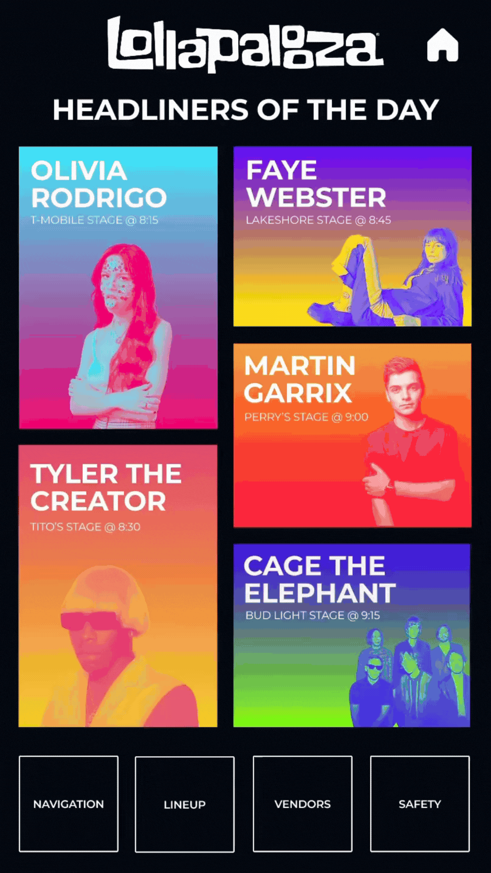
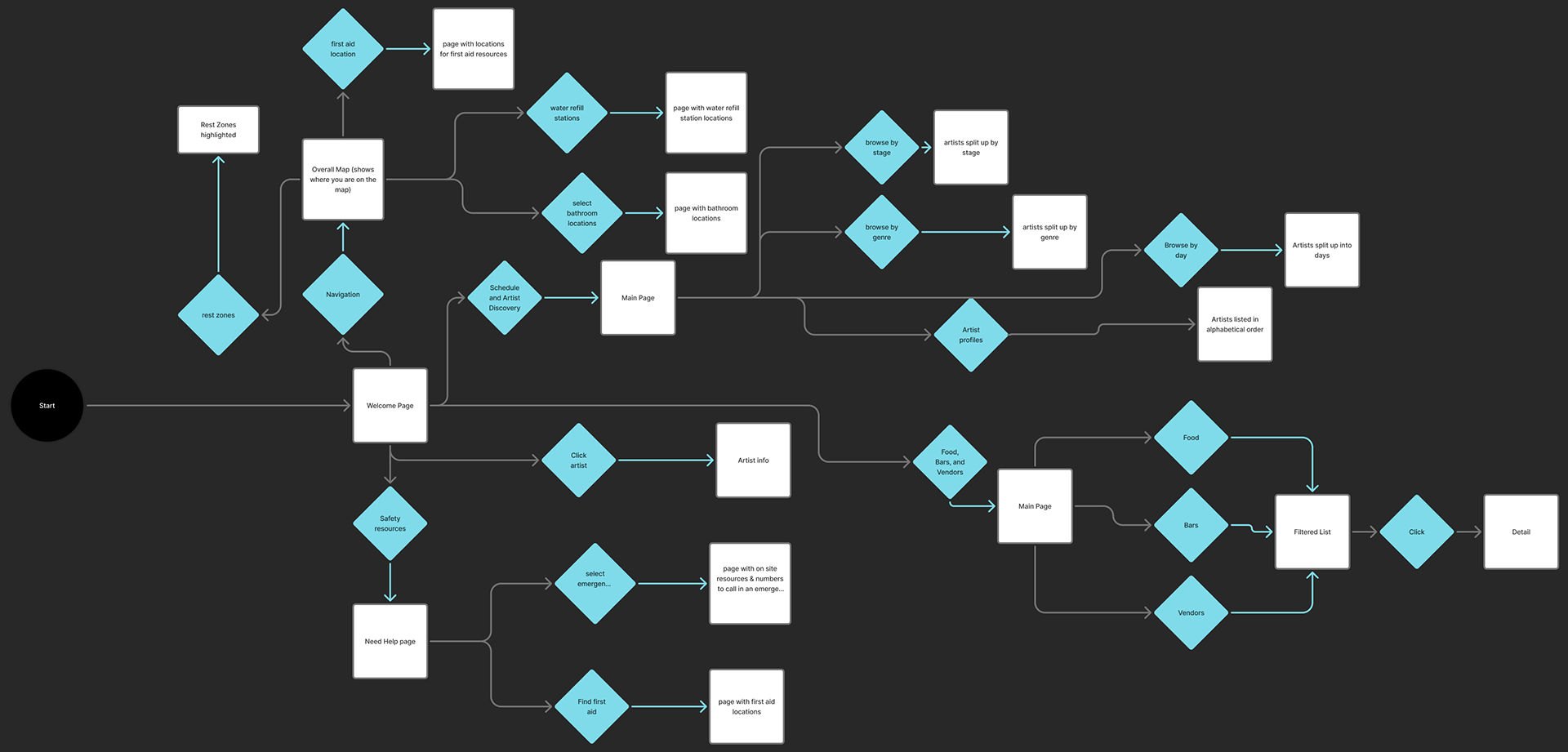
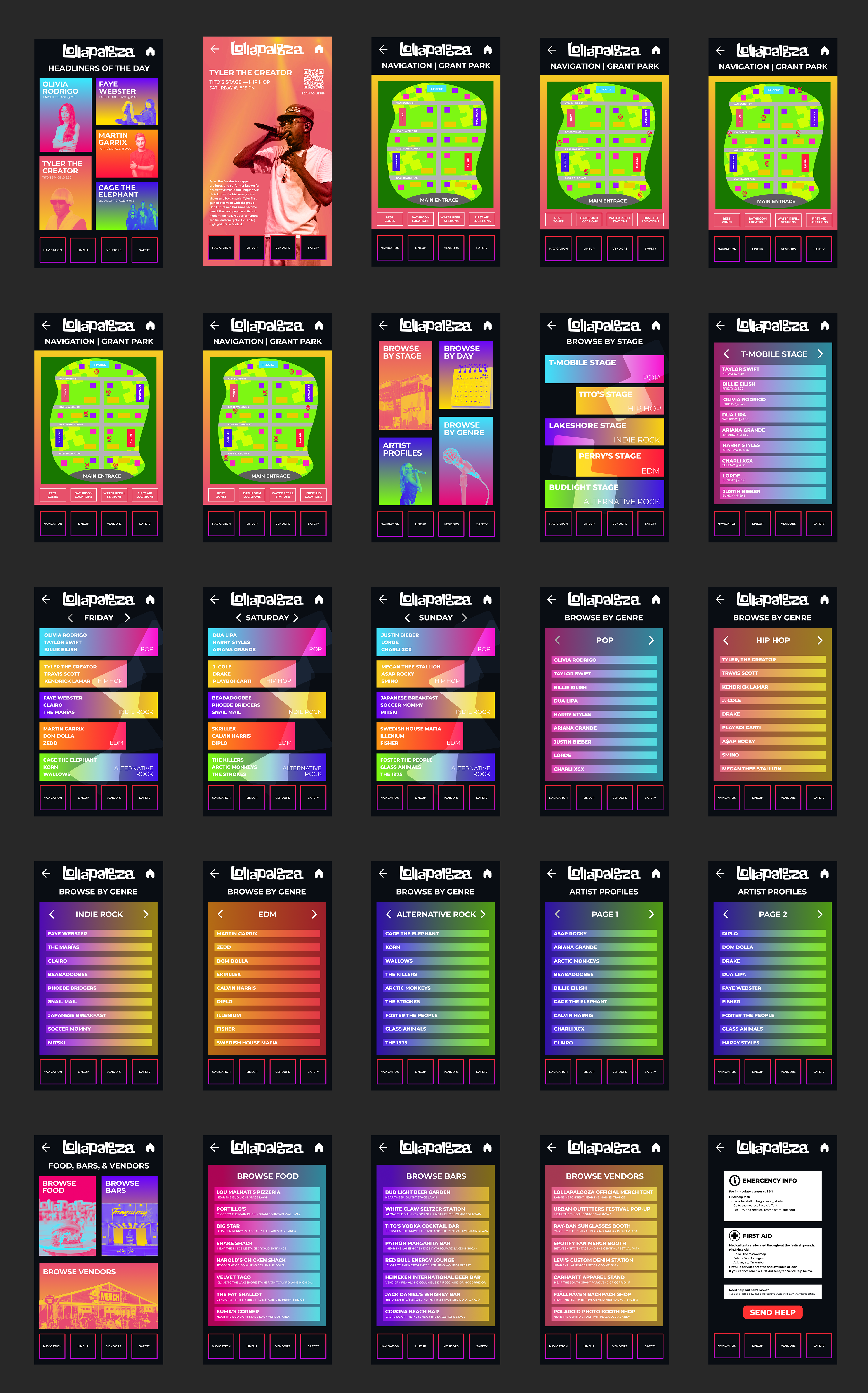
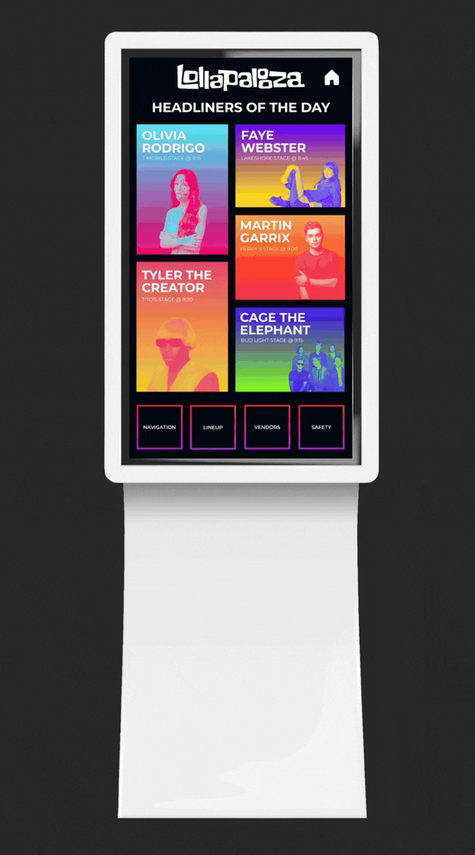
User Flow
The user begins at the welcome screen and can choose between navigation, artist discovery, food and vendor information, or safety resources. From there, the kiosk guides them through simple selections to quickly find locations, schedules, artist details, or emergency resources to help them navigate Lollapalooza efficiently.
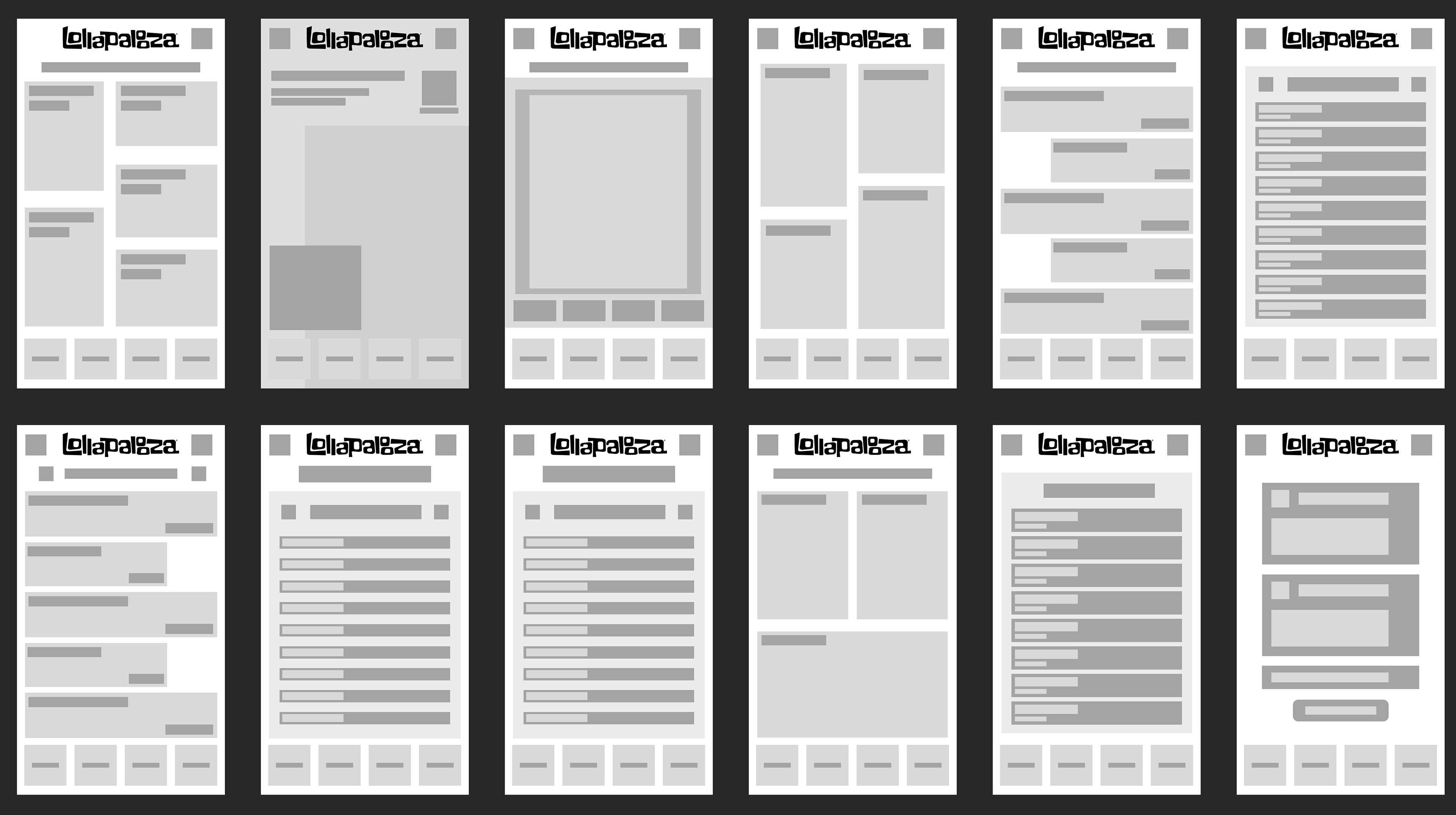
WIREFRAMES
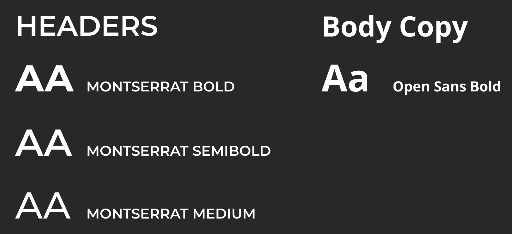
TYPOGRAPHY
Primary and Secondary Typefaces
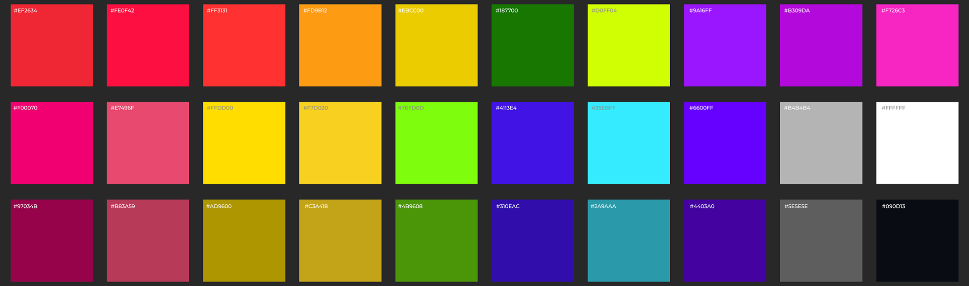
COLOR SYSTEM
This color palette is a variety of bright, high-energy colors to reflect the lively atmosphere of Lollapalooza and create an interface that feels inviting and easy to navigate in a crowded festival environment. The vibrant primary colors help different sections of the kiosk stand out, while the shaded variations provide depth and visual hierarchy within the interface. Compared to previous years, the 2026 palette expands on the colorful identity by introducing a wider variety of colors and darker shade variations to create a more dynamic and modern digital experience.
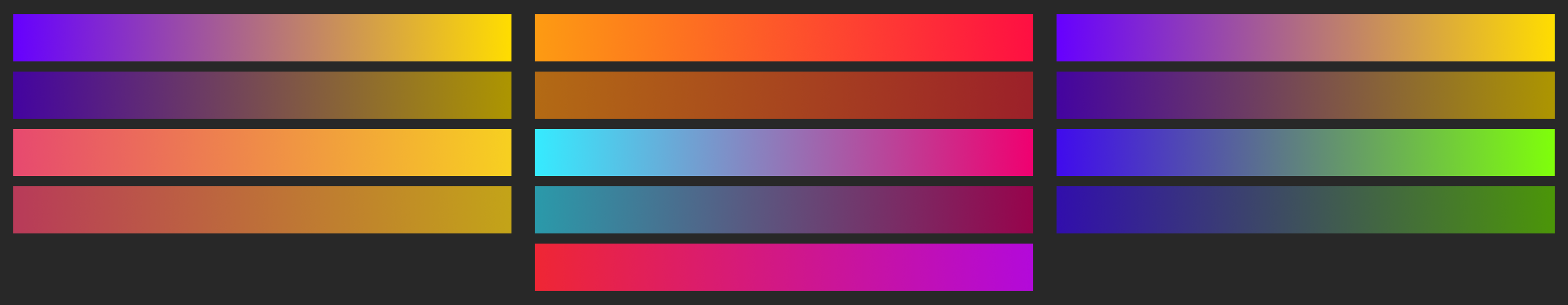
GRADIENTS
Gradients are used throughout the kiosk interface to create a vibrant and energetic visual style that reflects the lively atmosphere of Lollapalooza. They also help add depth and visual flow between sections, making the interface feel more dynamic and engaging for users as they navigate each page.
UI DESIGN
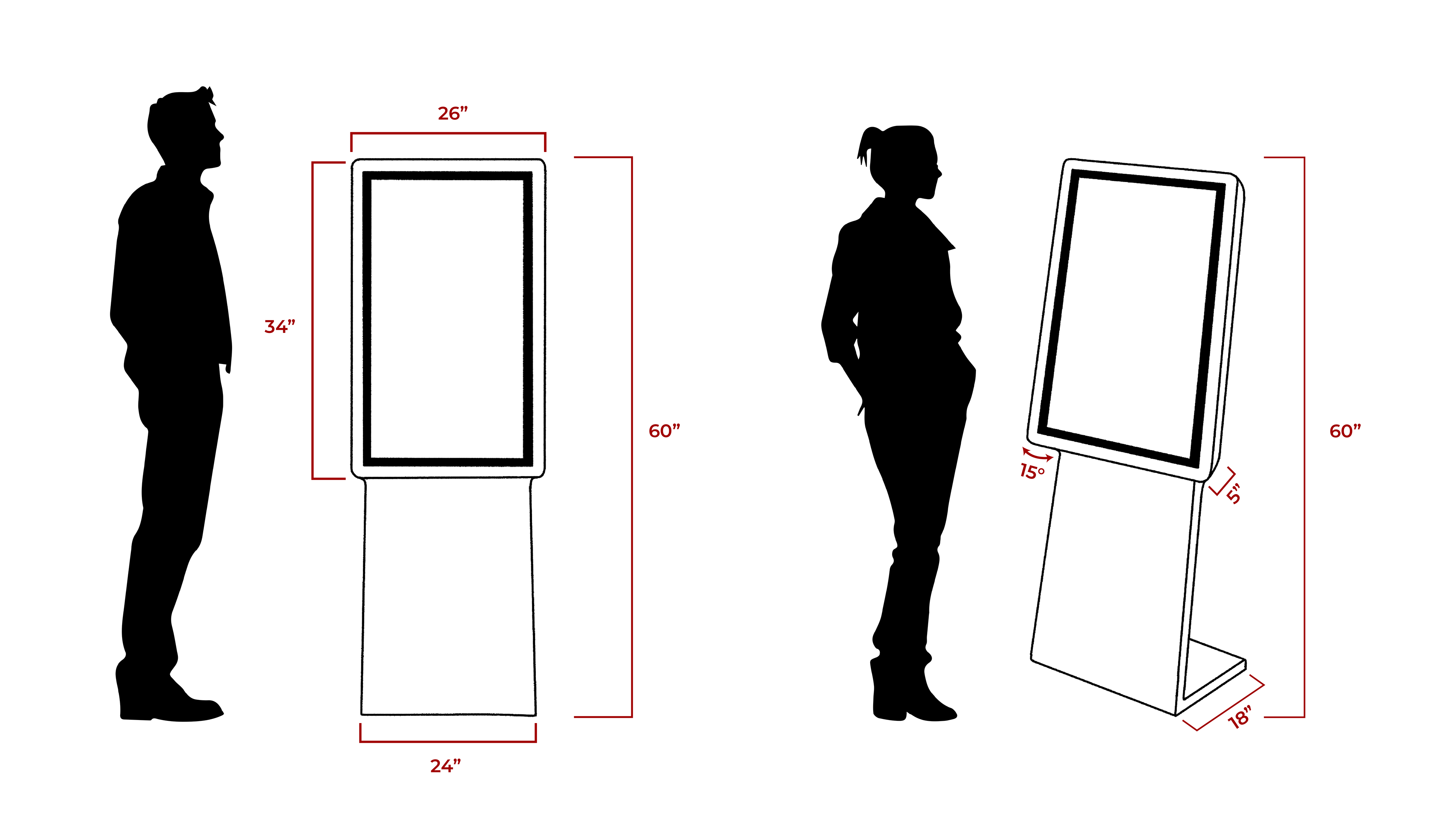
KIOSK DESIGN & DIMENSIONS
The kiosk was designed at a total height of 60 inches to keep the screen at a comfortable eye level for most users while standing. Its proportions and stable base were carefully considered to ensure the kiosk remains accessible, easy to interact with, and sturdy in the busy environment of Lollapalooza.
OVERVIEW
The final kiosk design creates a clear and accessible way for attendees to navigate Lollapalooza by combining an engaging user flow, vibrant visual design, and organized information. Through interactive maps, artist discovery features, vendor listings, and safety resources, the kiosk helps reduce confusion in the crowded festival environment and allows users to quickly find the information they need. Overall, the project demonstrates how thoughtful digital design can improve the festival experience by making it more efficient, engaging, and easier to navigate.