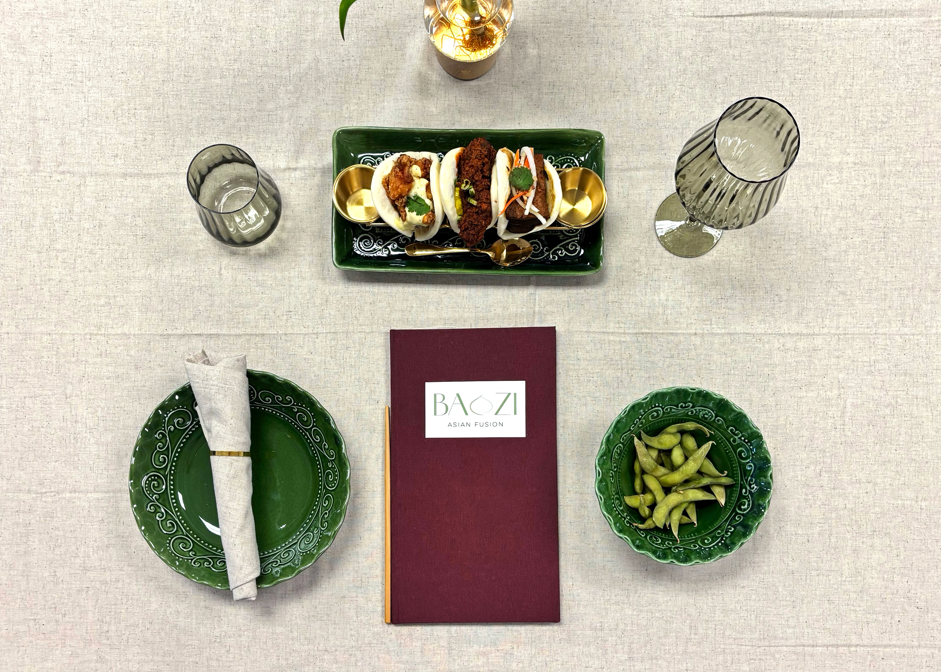
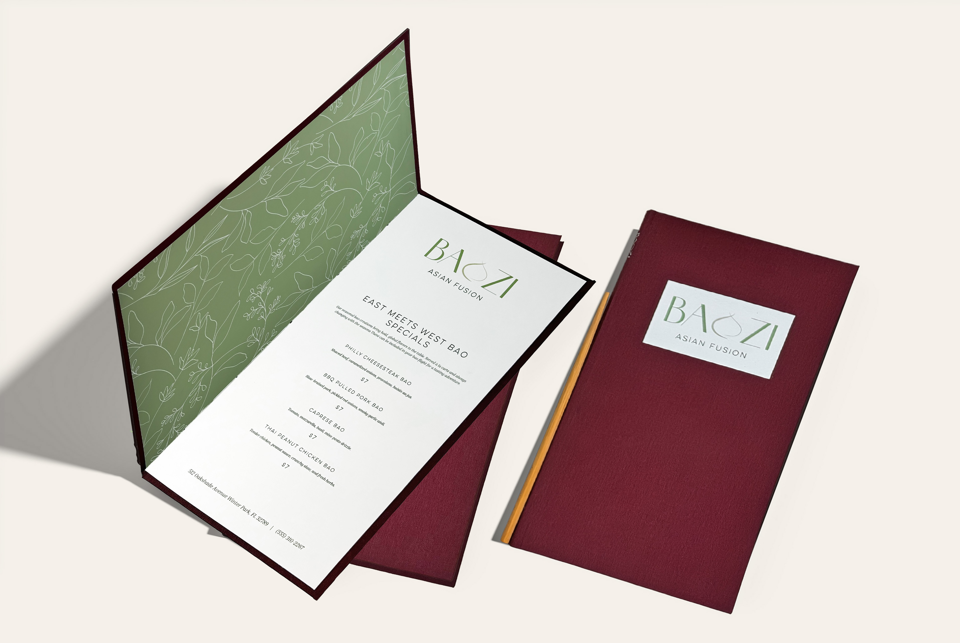
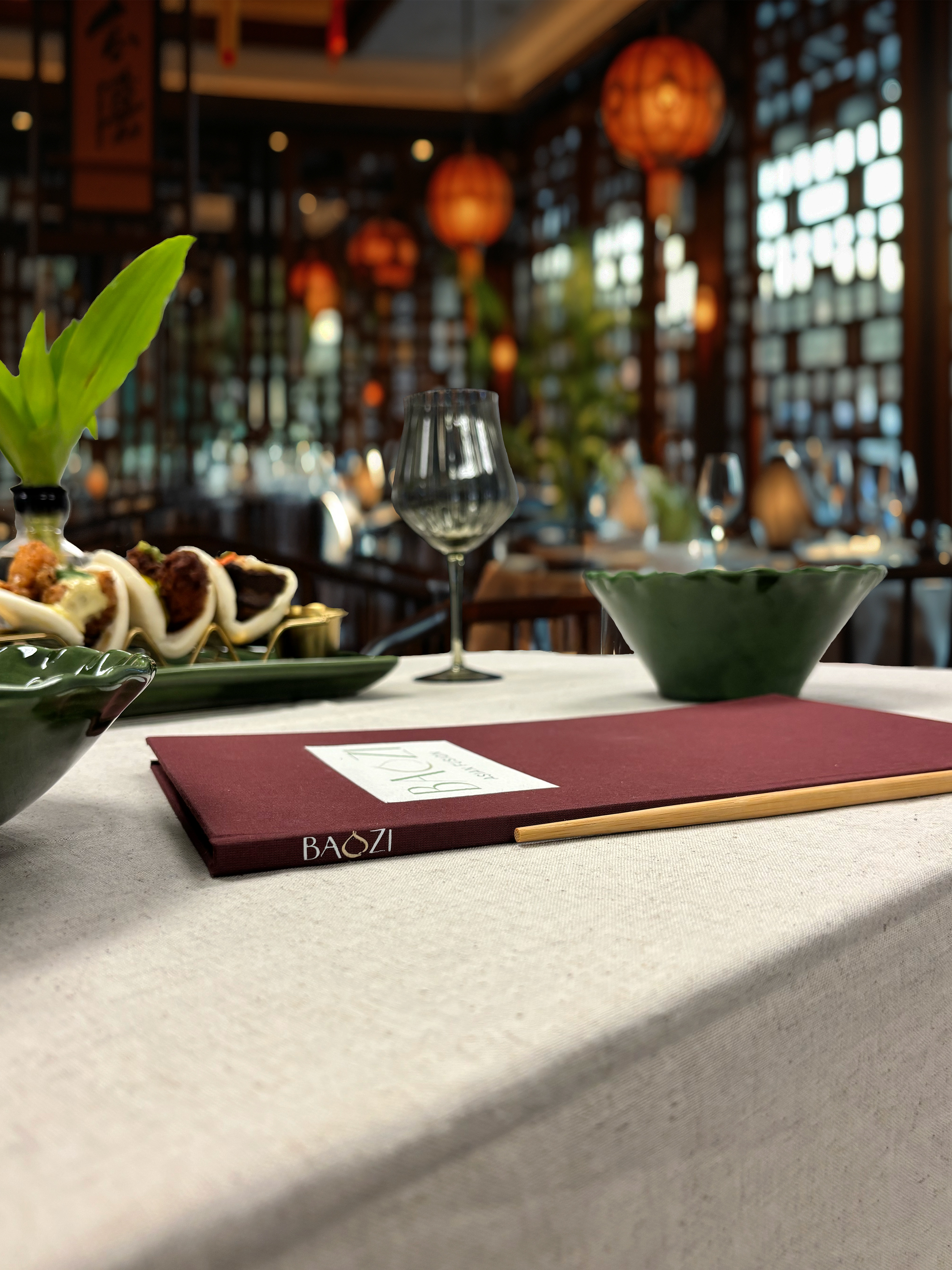
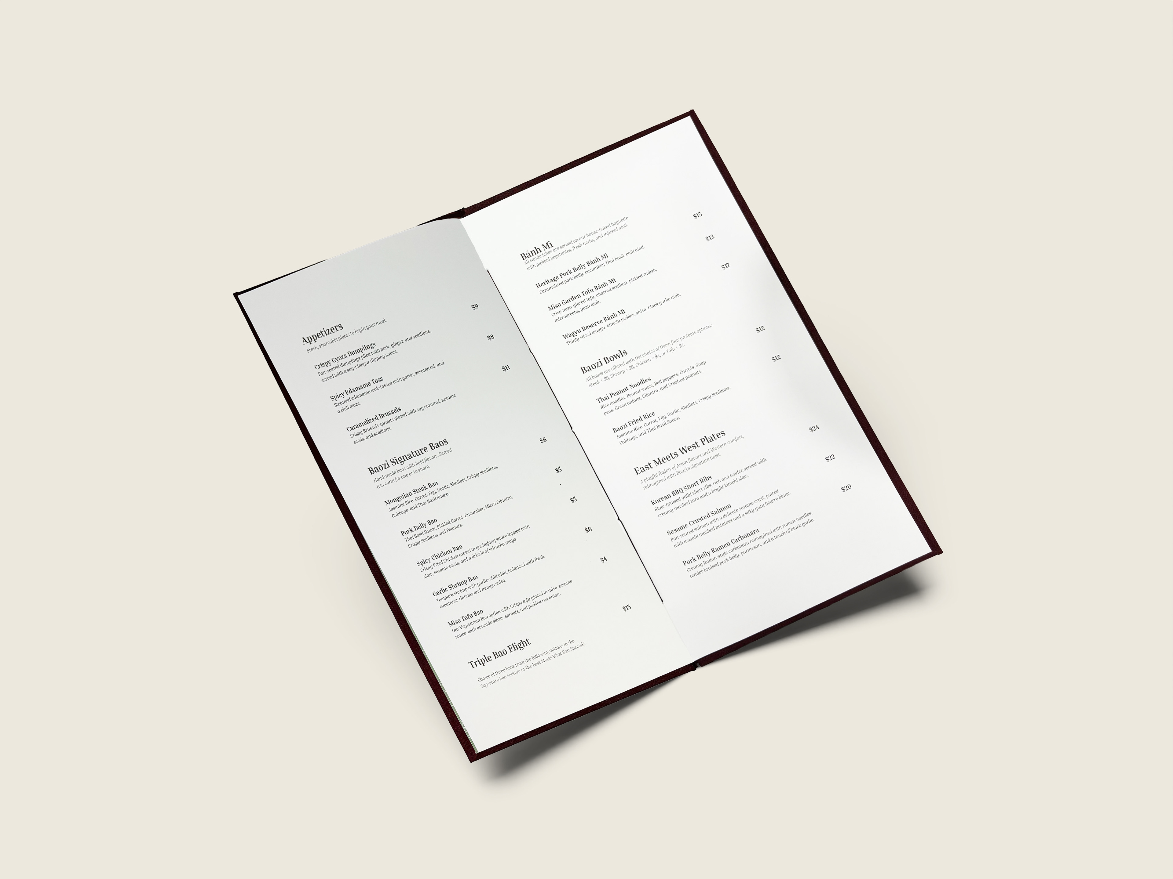
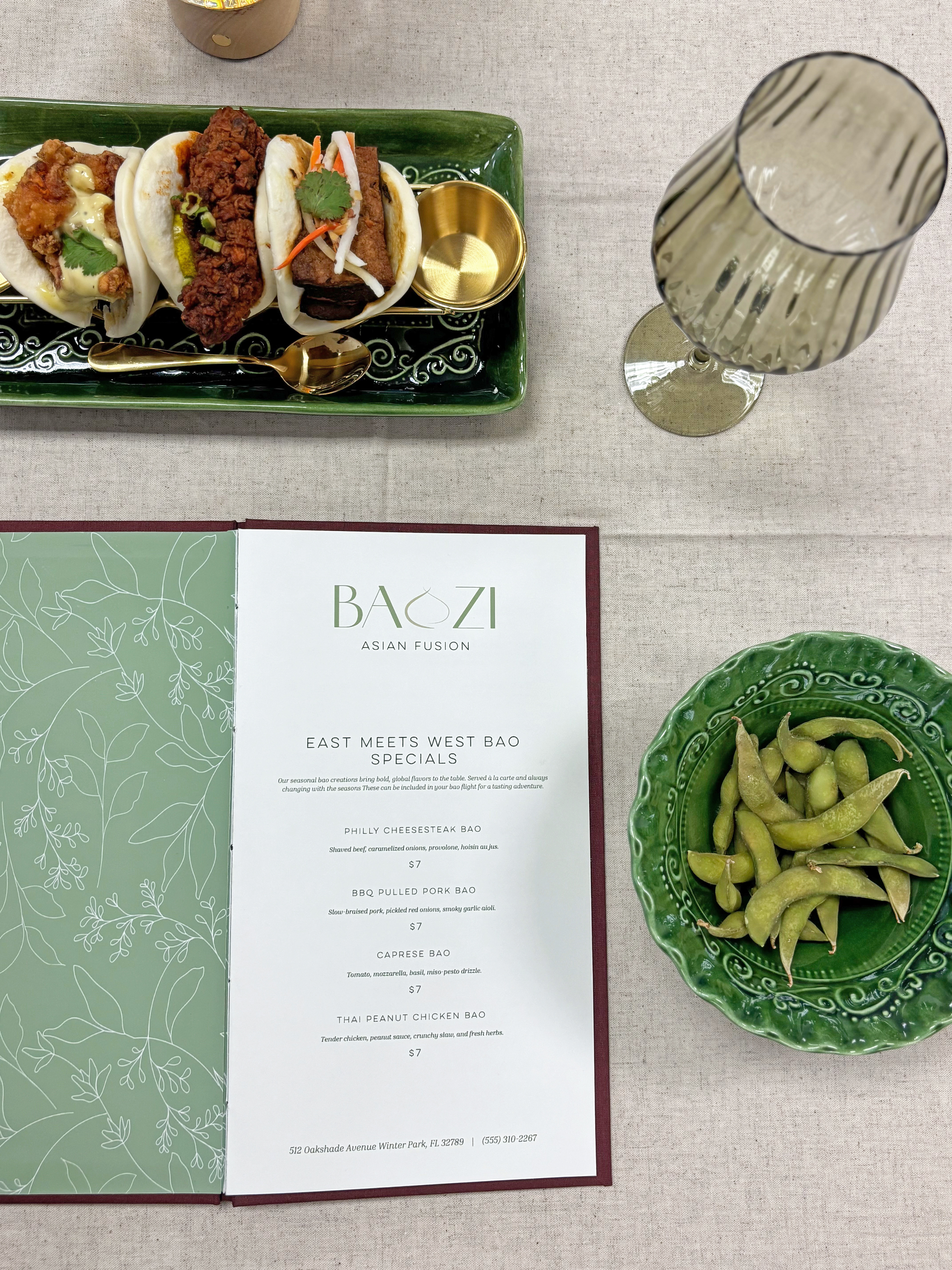
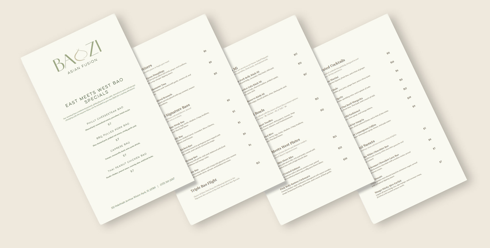
Baozi Asian Fusion is a modern restaurant concept centered on creating an elevated yet affordability dining experience. The brand identity and menu system were developed to balance the sophistication of high-end dining with the warmth and accessibility of contemporary Asian fusion cuisine.

LOGO ITERATIONS
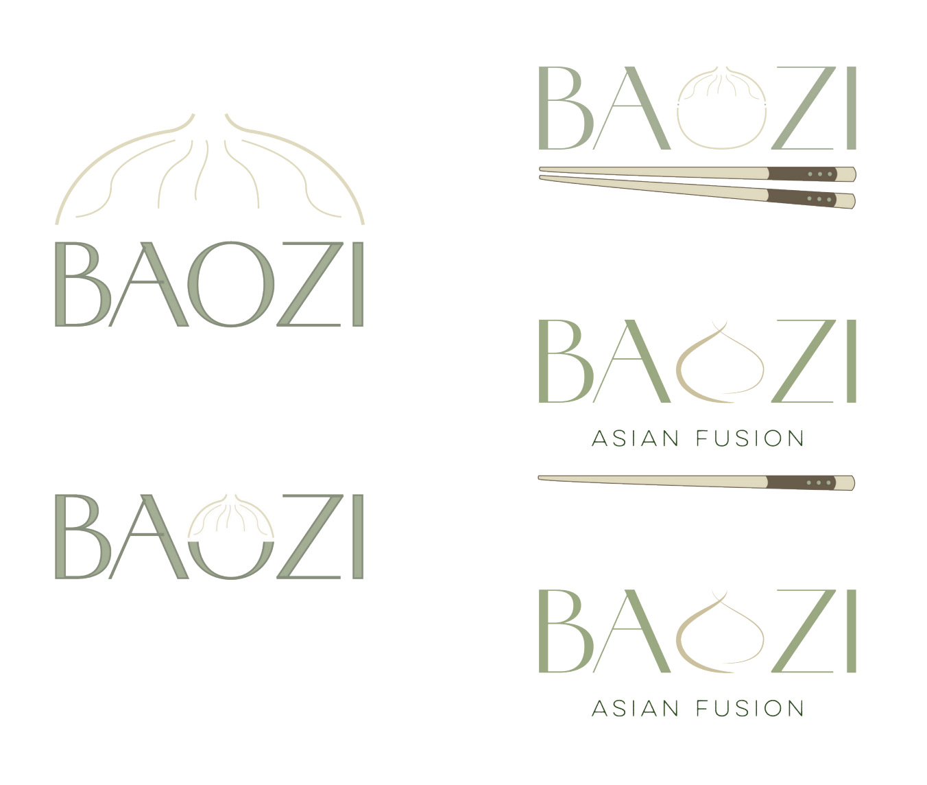
FINALIZED LOGO

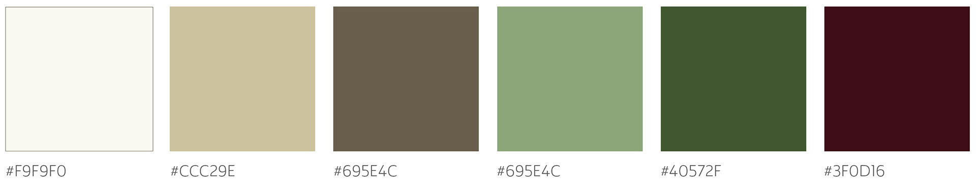
Color Palette
The color palette was chosen to support the restaurant’s balance between luxury and approachability. Rich and refined colors help communicate a more elevated dining experience, while the overall palette remains warm and inviting.
TYPOGRAPHY
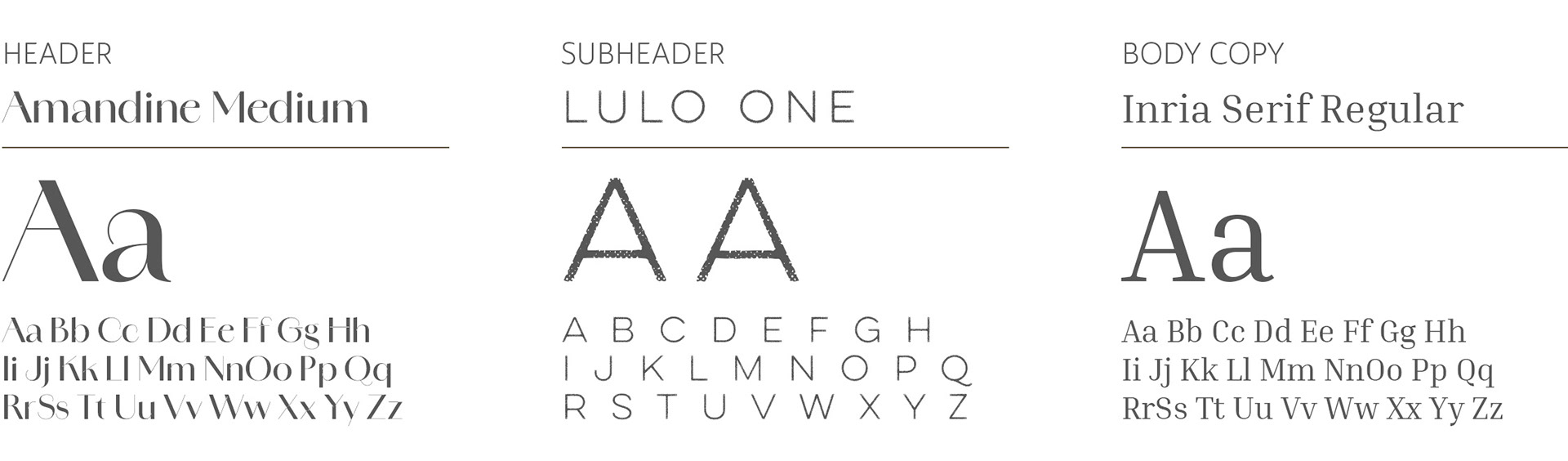
A distinctive typeface was used for headings and section titles to give the brand personality, while a legible typeface was selected for body copy to ensure the menu remains easy to read. Together, these typographic choices reinforce the restaurant’s modern feel.
PRODUCTION PROCESS
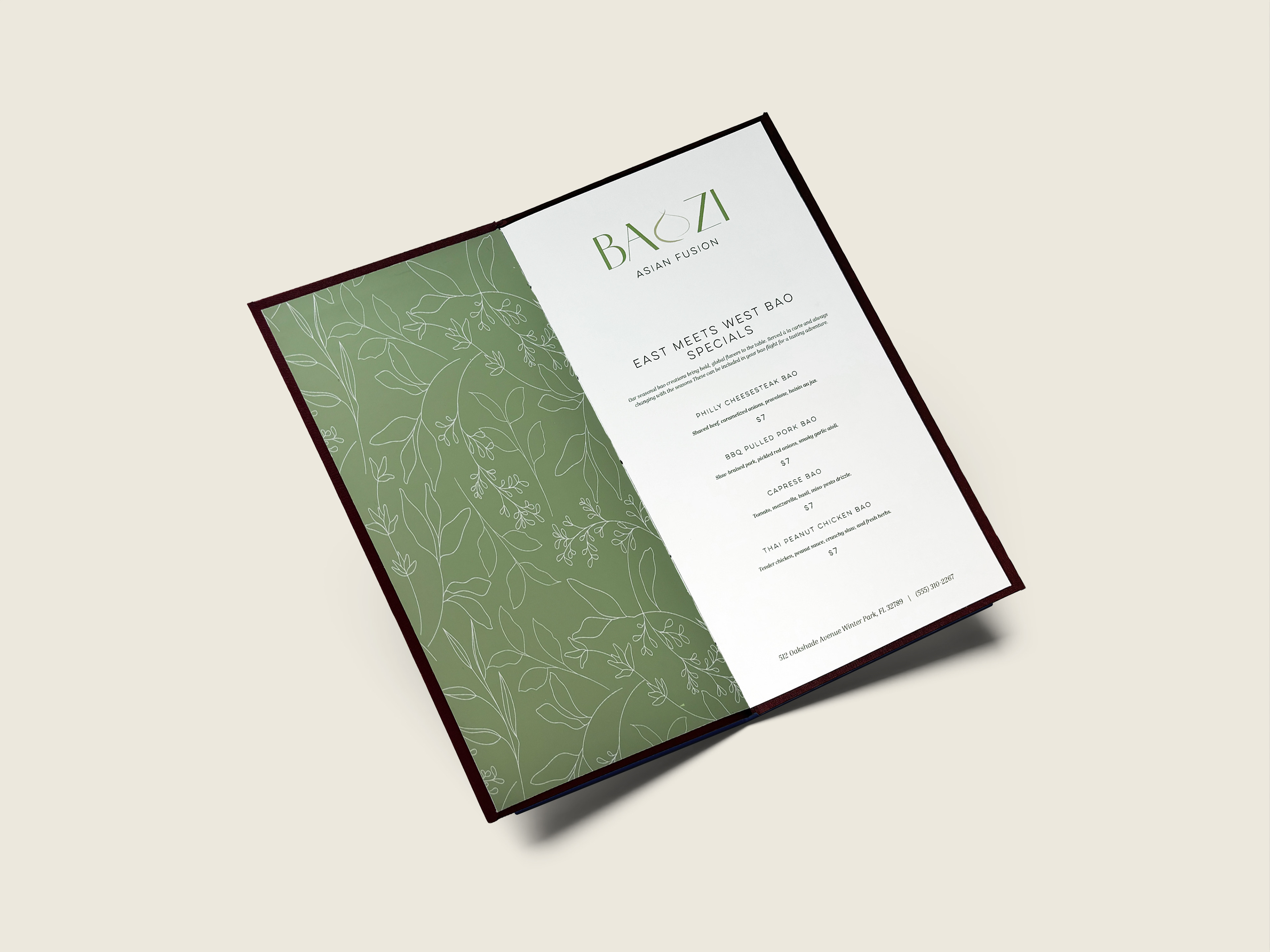
I prepared the menu for print, then printed, trimmed, and bound the final piece by hand. Using bookbinding techniques, I constructed the hard cover and assembled the pages into a finished physical menu, combining digital and analog design.