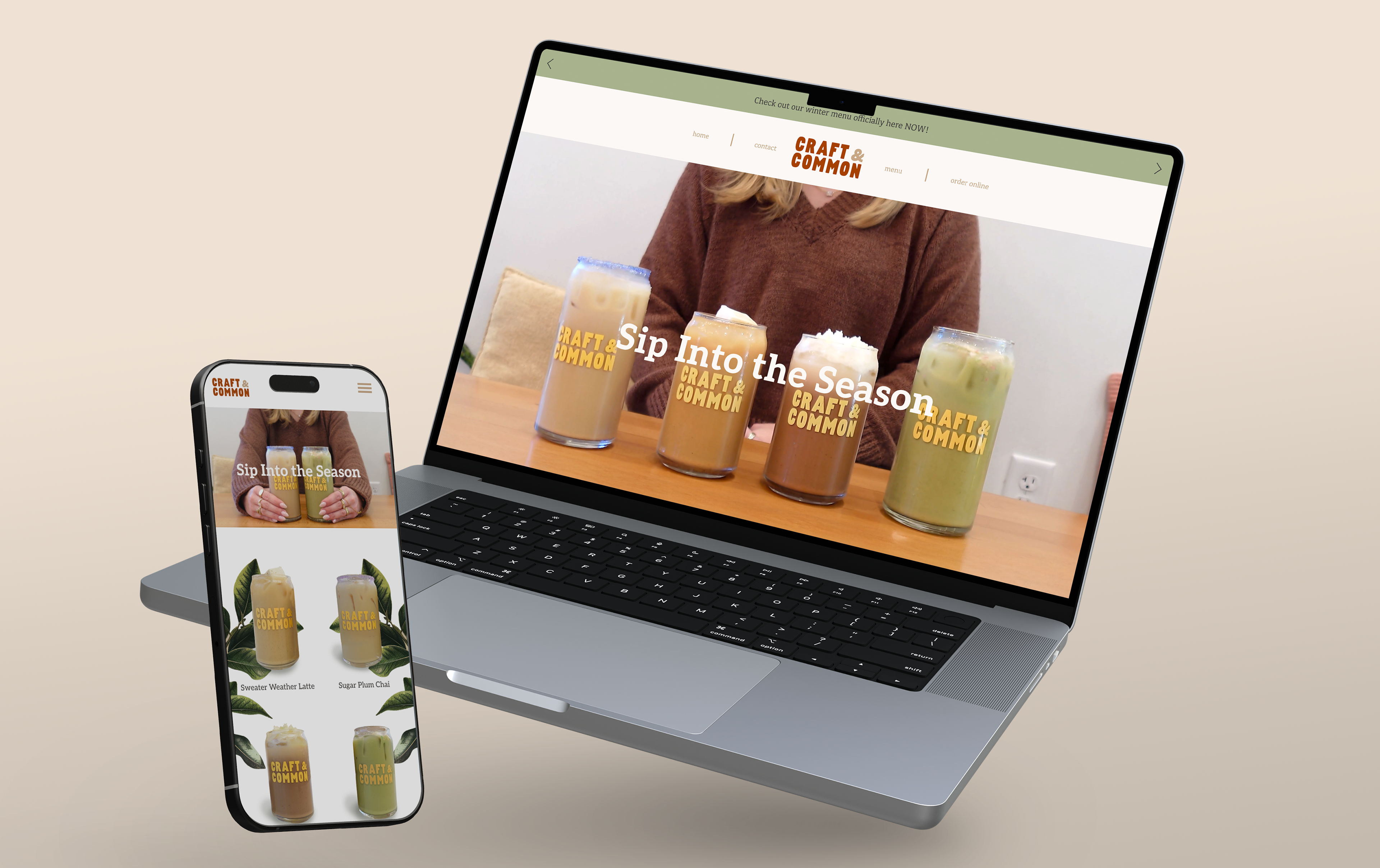
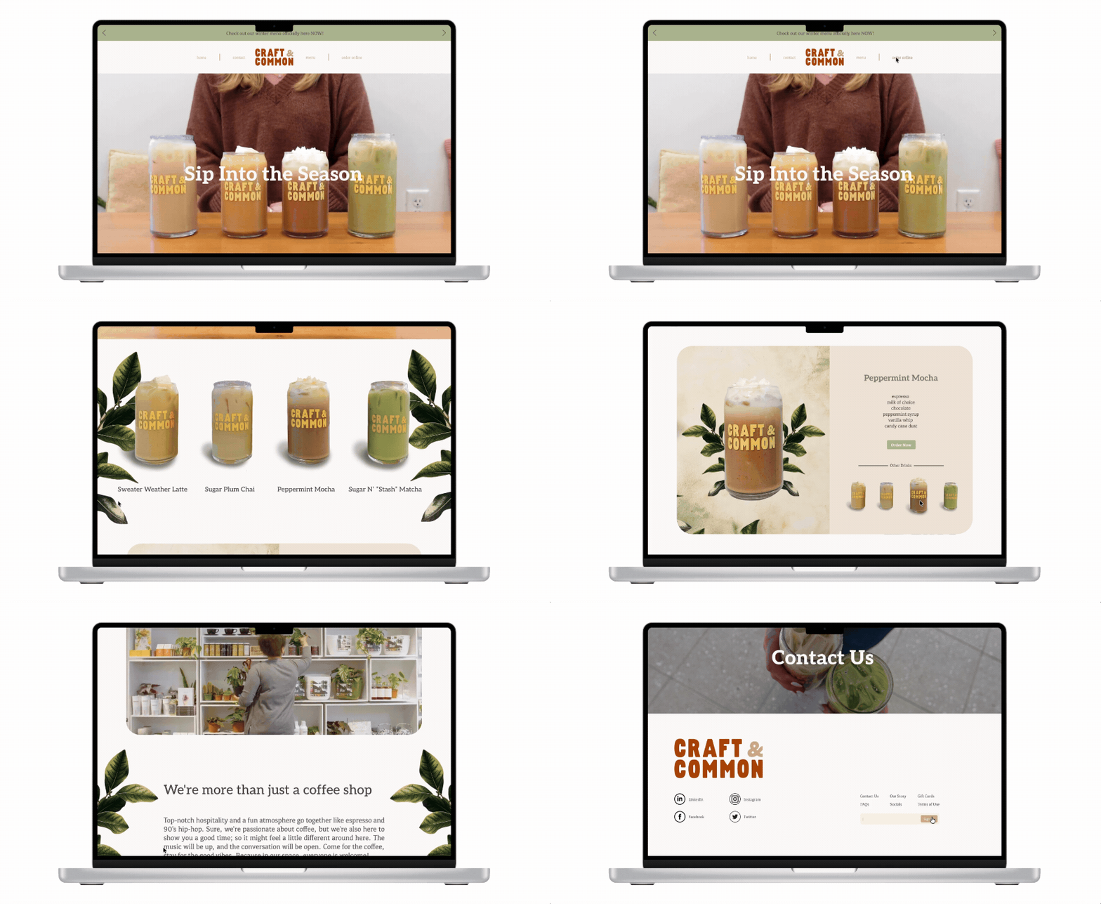
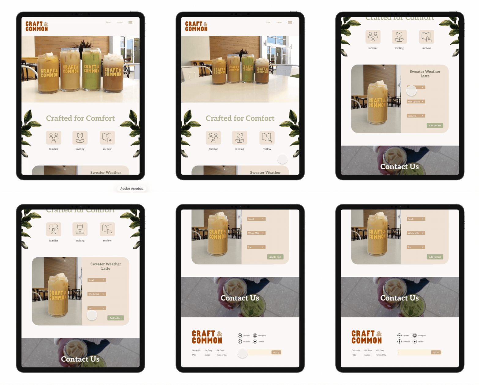
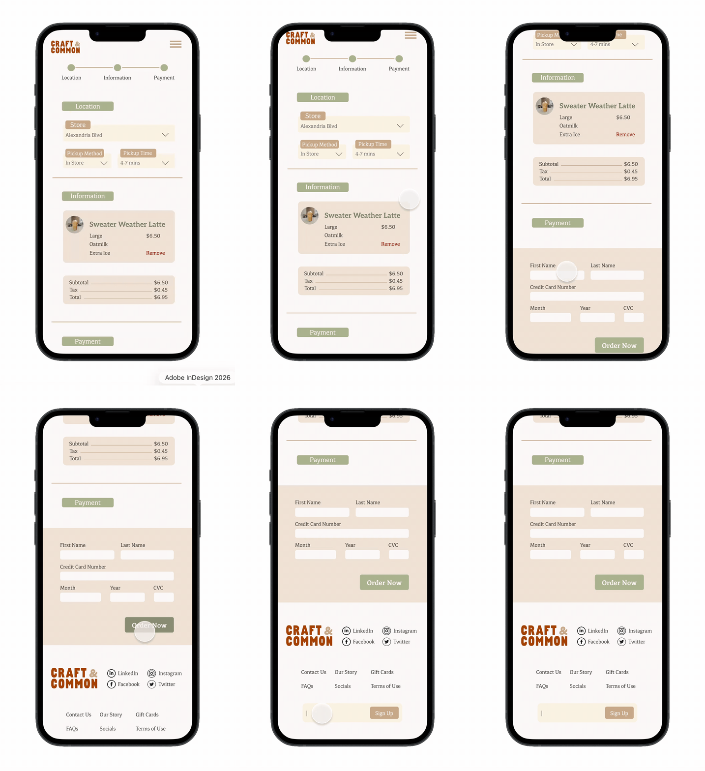
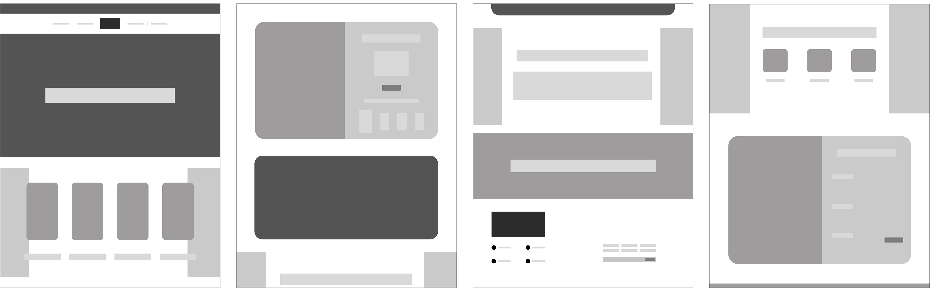
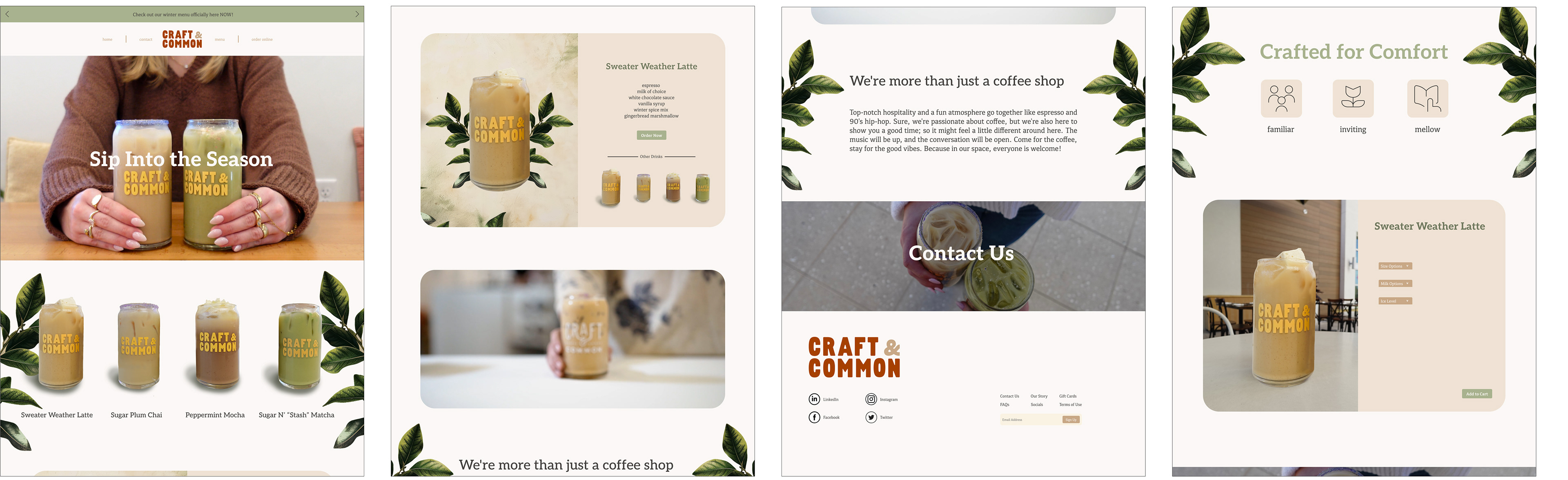
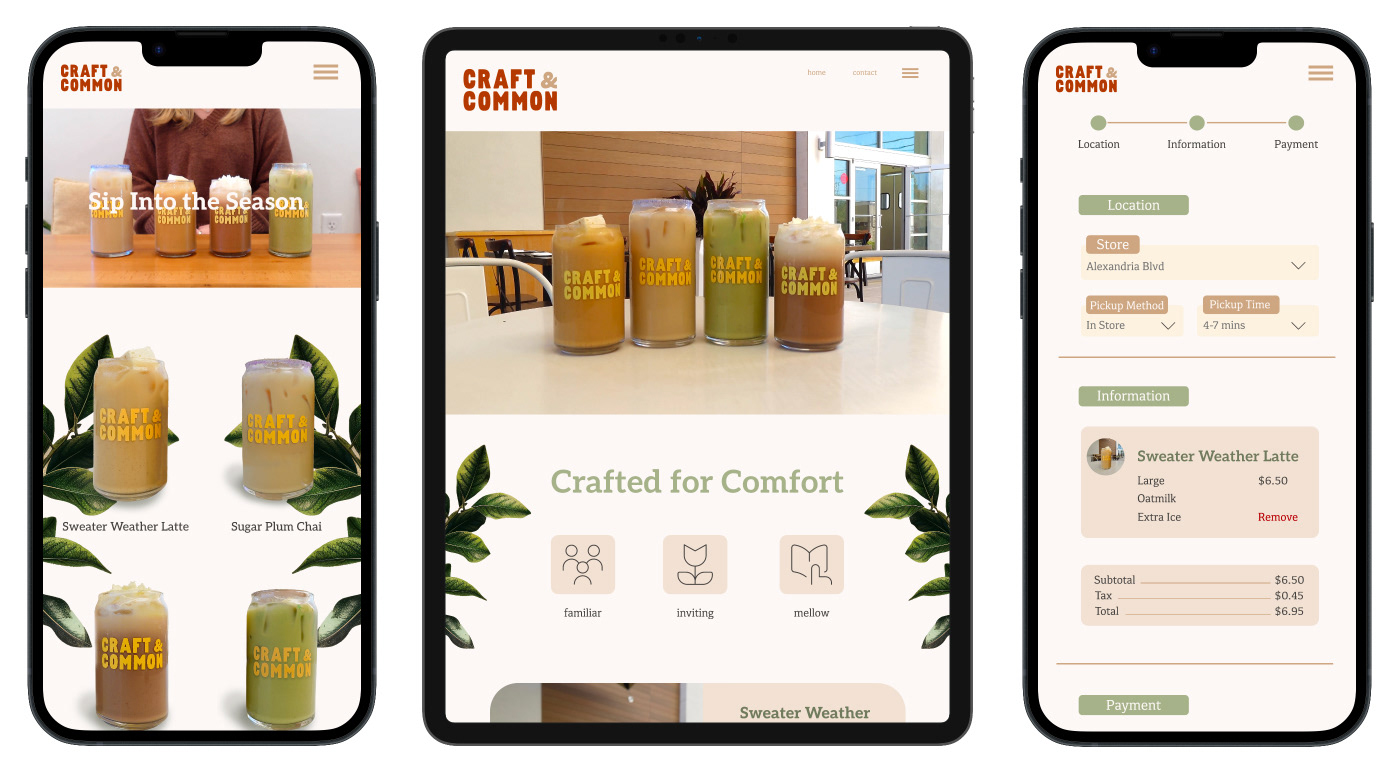
Craft & Common’s existing digital presence lacked the warmth and visual cohesion of the brand while making online ordering feel less intuitive. The rebrand creates a responsive e-commerce experience that combines its cozy, seasonal identity with clear navigation, strong visual hierarchy, and a seamless path from browsing to checkout across all devices.
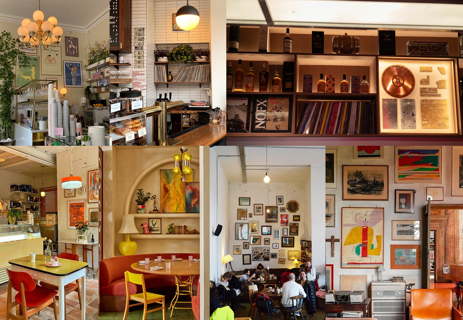
Moodboard
PHOTOGRAPHY & VIDEO
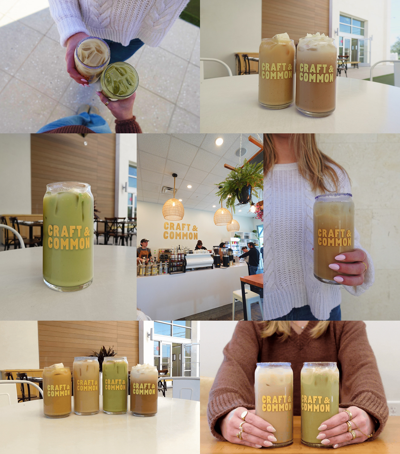
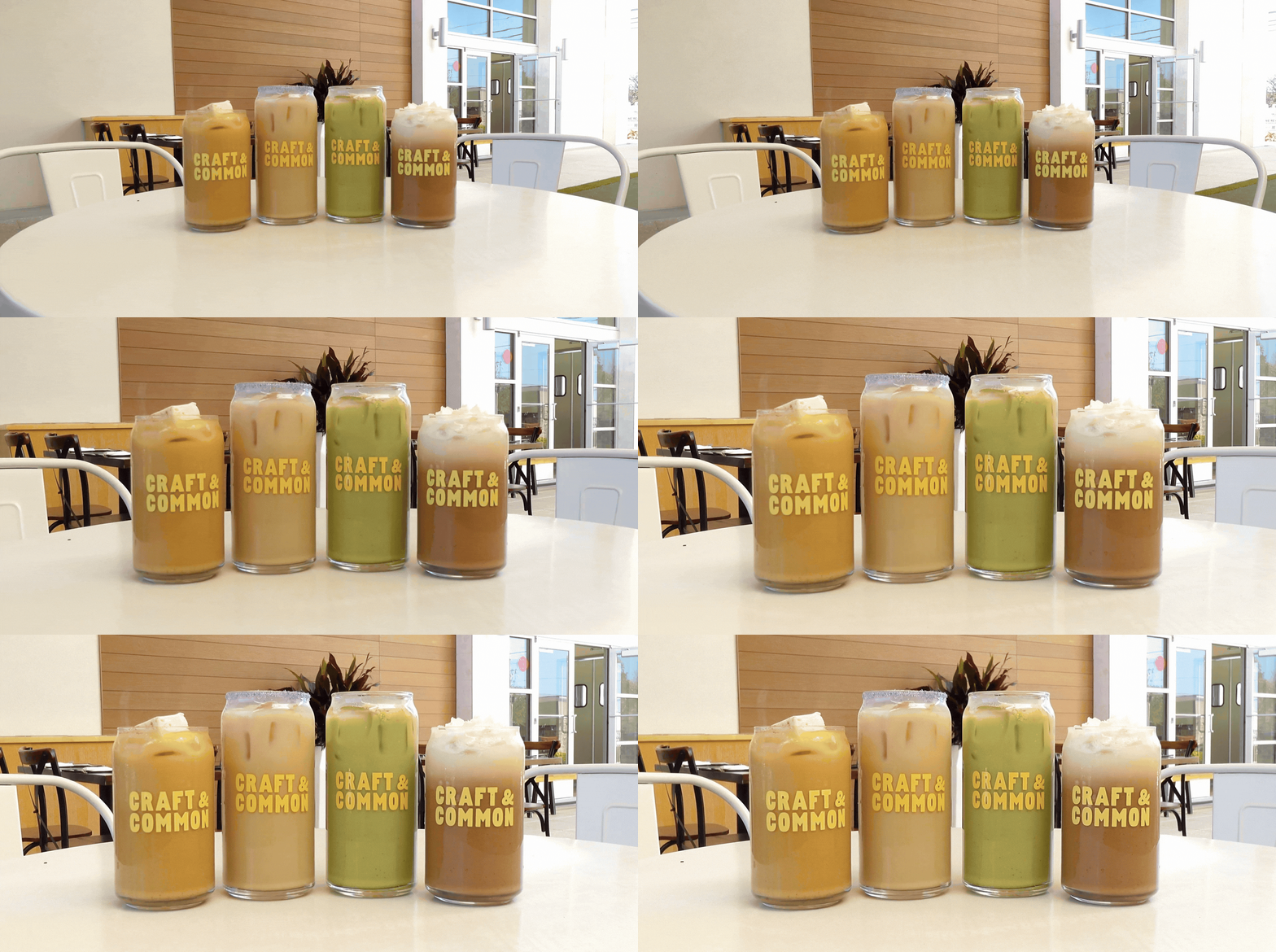
Creating original photography and video for the rebrand allowed me to capture Craft & Common’s warm, inviting atmosphere firsthand. This helped maintain visual consistency, strengthen the brand identity, and create a more personal and cohesive website experience.
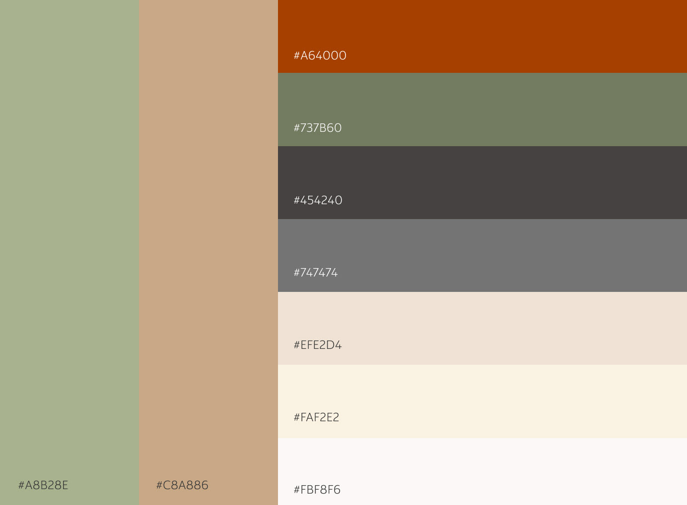
COLOR PALETTE
TYPOGRAPHY
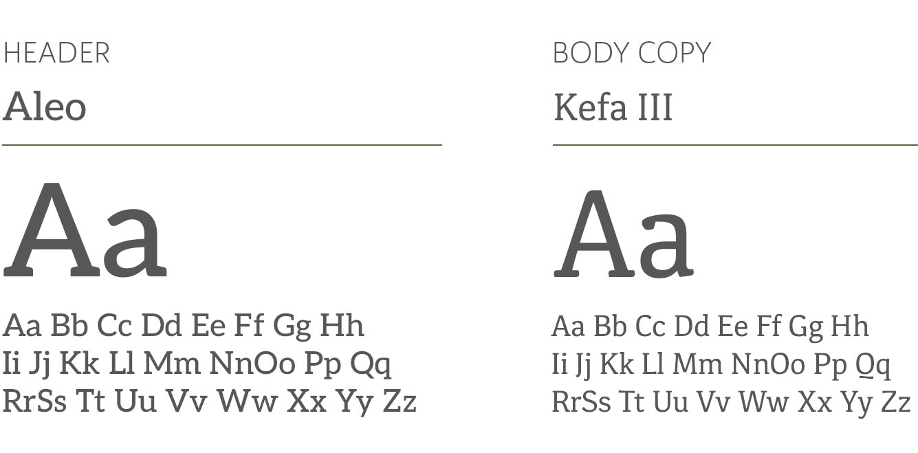
Aleo was chosen for headers to complement Craft & Common’s existing logo while creating strong visual hierarchy. Kefa III was paired for body copy to provide readability and contrast. Together, the typefaces create a cohesive and organized brand identity.
This project focused on translating Craft & Common’s brand identity into a cohesive digital experience. Through firsthand visual research and original content, I developed a responsive interface with intentional typography, layout, and visual hierarchy. The result strengthened my ability to translate brand strategy into engaging, functional digital experiences.