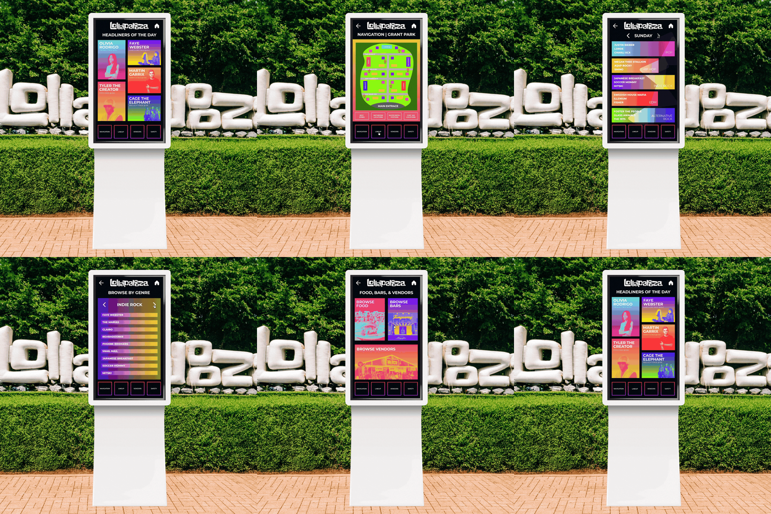
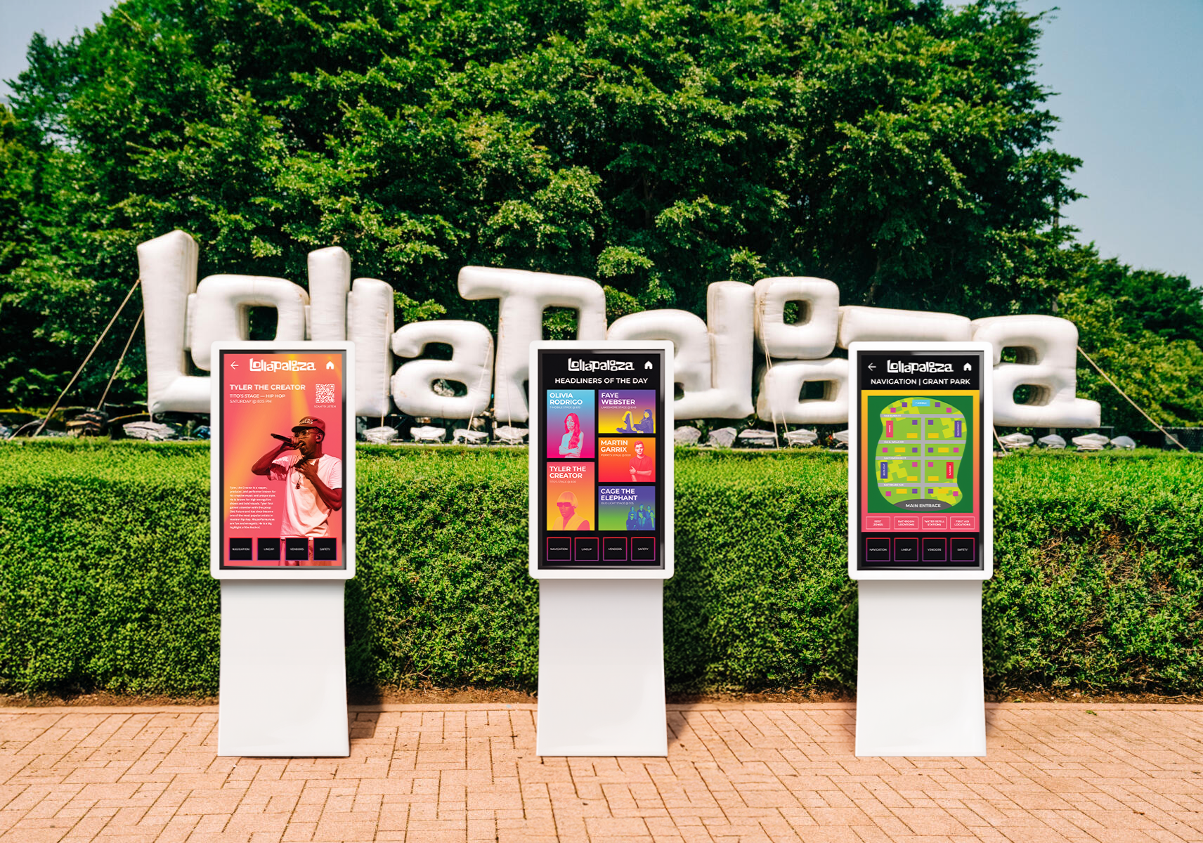
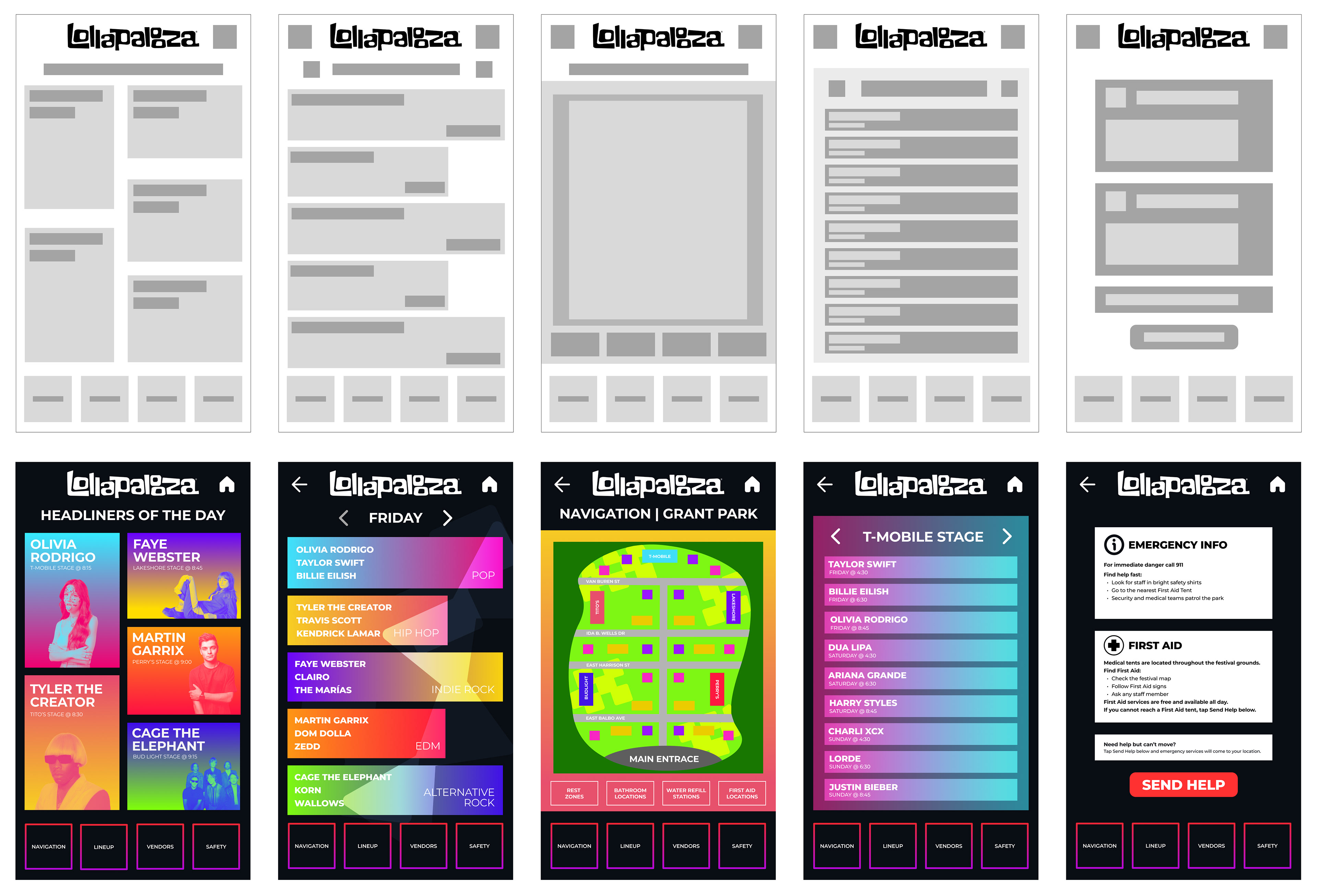
Large festivals like Lollapalooza can feel overwhelming due to their size, crowds, and numerous stages and amenities. This interactive kiosk simplifies navigation by providing digital maps, schedules, and directions, helping attendees find what they need while creating a more organized and seamless festival experience.
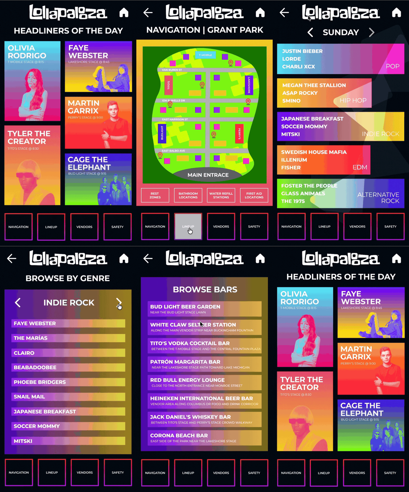
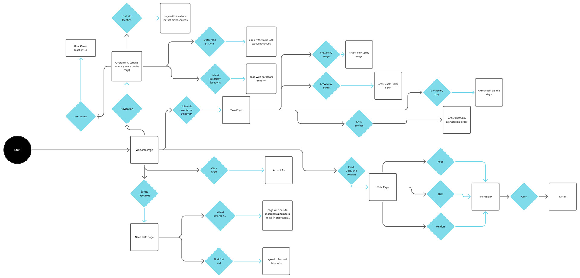
USERFLOW
The user begins at the welcome screen and can choose between navigation, artist discovery, food and vendor information, or safety resources. From there, the kiosk guides them through simple selections to quickly find locations, schedules, artist details, or emergency resources to help them navigate Lollapalooza efficiently.
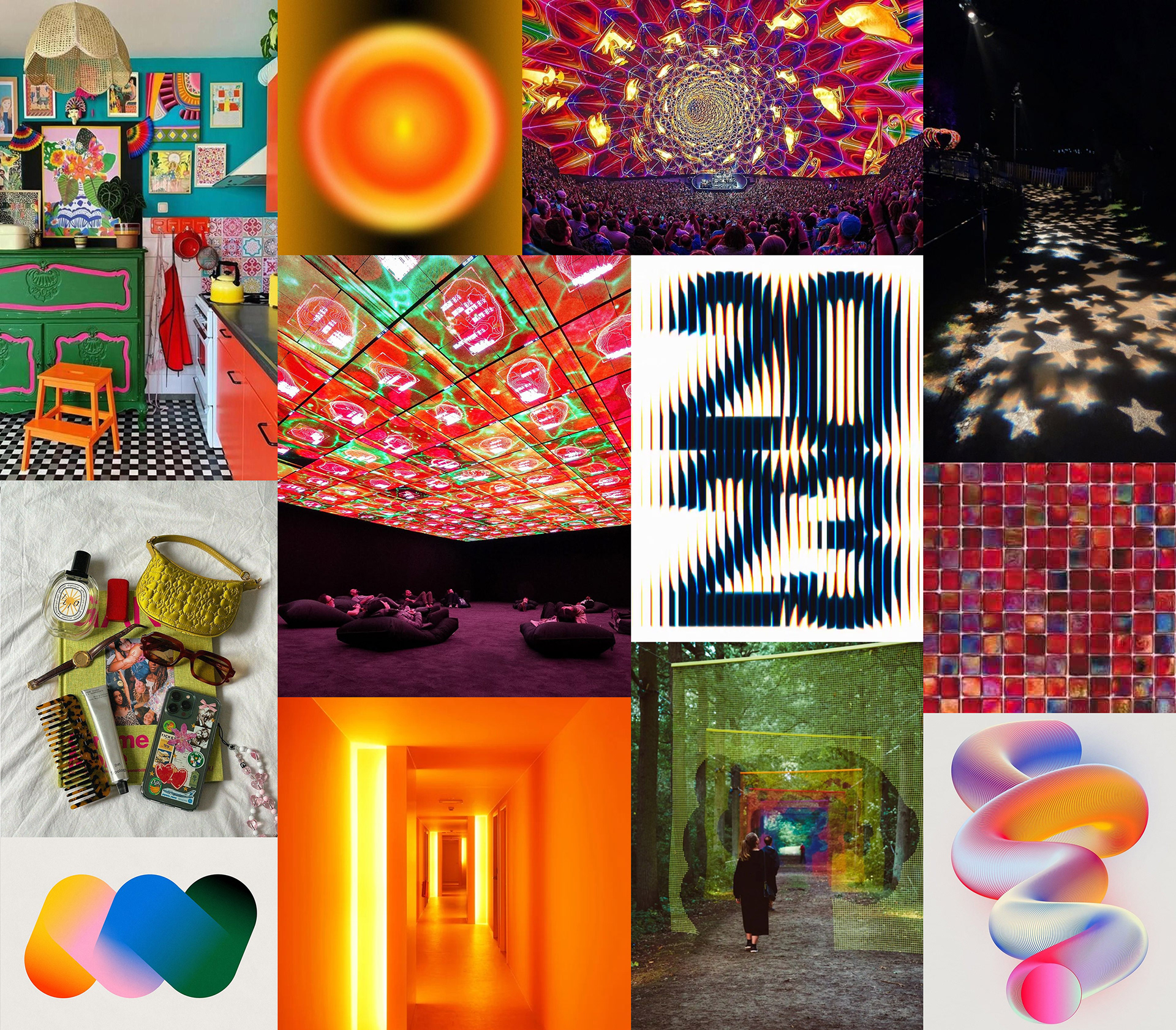
MOODBOARD
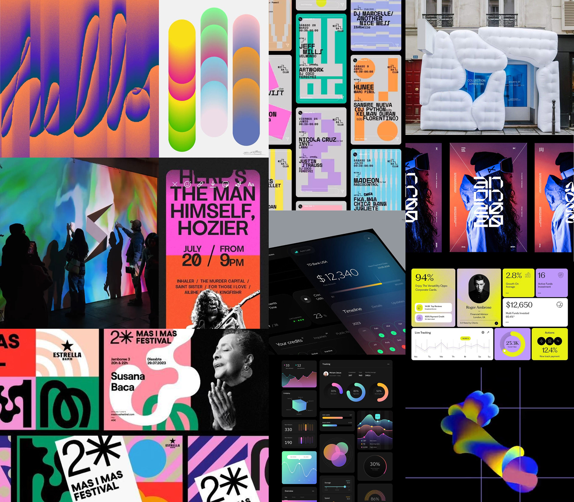
INSPIRATION BOARD
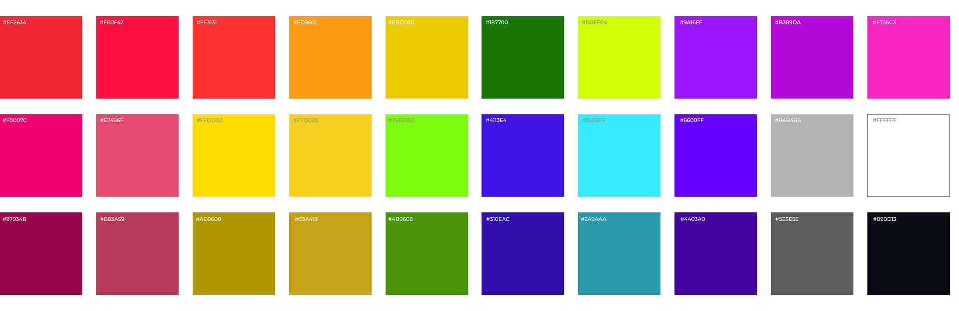
COLOR PALETTE
GRADIENTS

TYPOGRAPHY
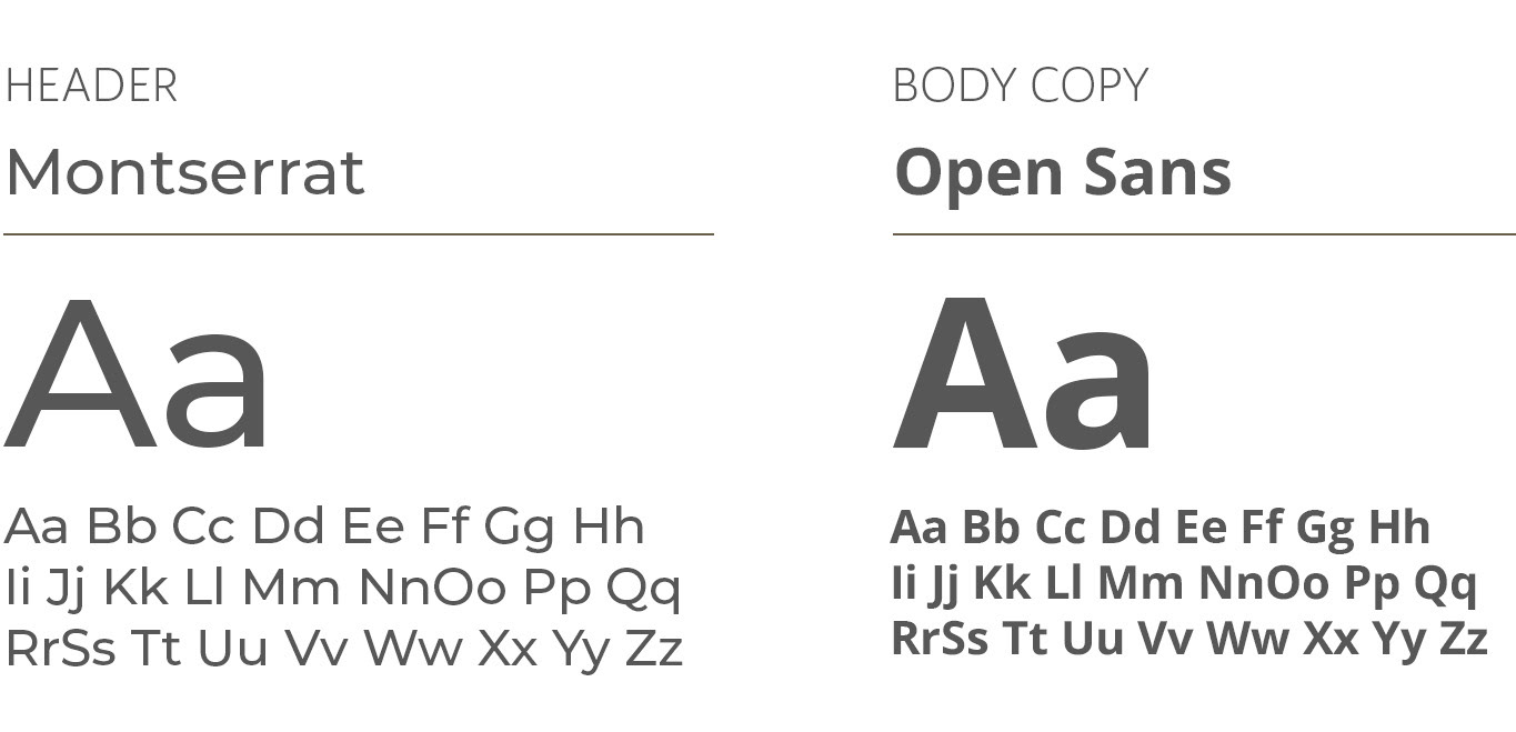
Primary and Secondary Typefaces
KIOSK DESIGN & DIMENSIONS
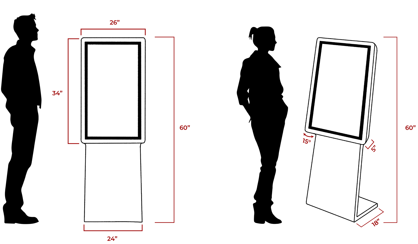
The kiosk was designed at a total height of 60 inches to keep the screen at a comfortable eye level for most users while standing. Its proportions and stable base were carefully considered to ensure the kiosk remains accessible, easy to interact with, and sturdy in the busy environment of Lollapalooza.
The final kiosk design provides an intuitive way to navigate Lollapalooza through interactive maps, artist discovery, vendor listings, and safety resources. The experience combines engaging visuals with organized information to make the festival more efficient, accessible, and easy to navigate.